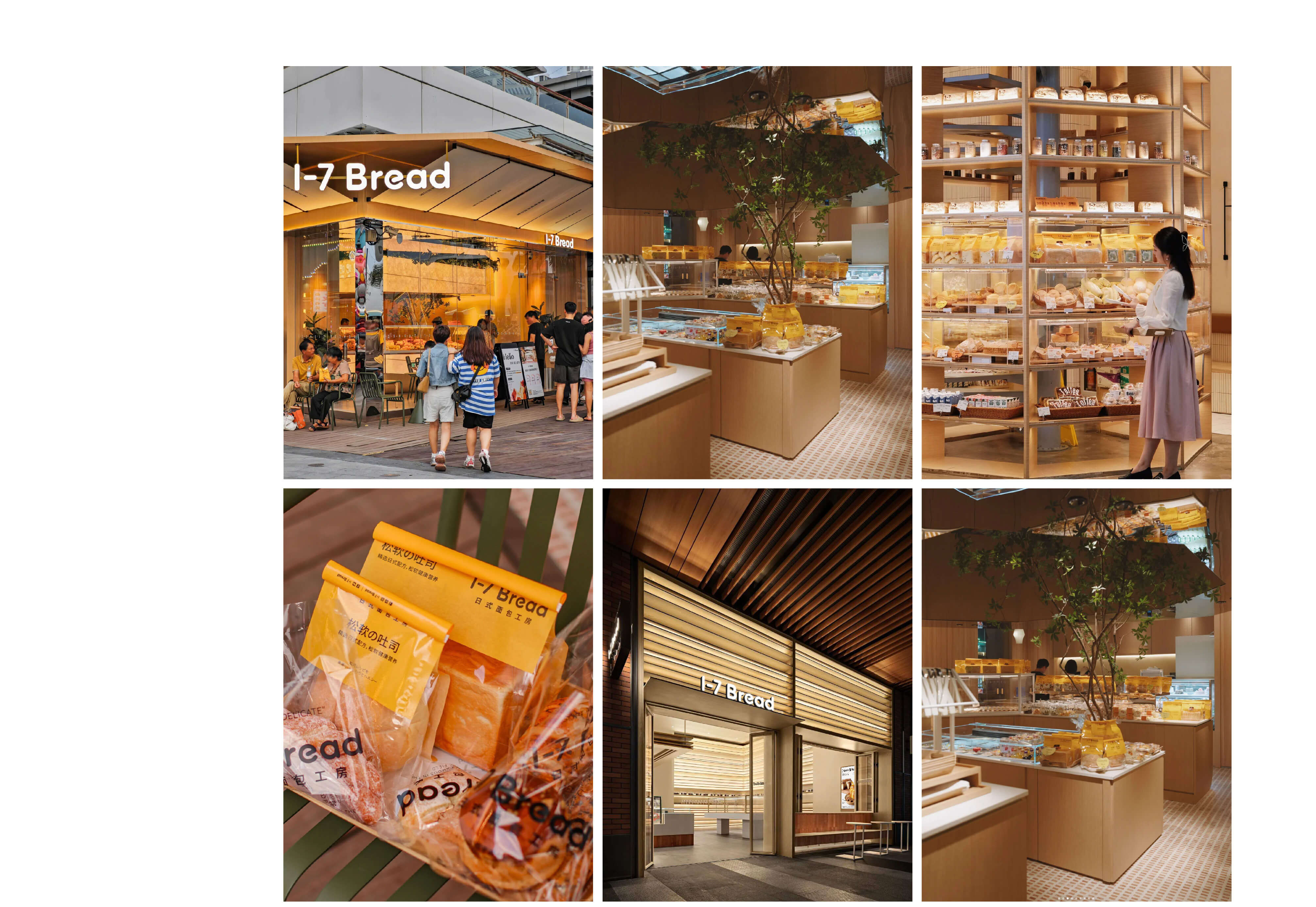
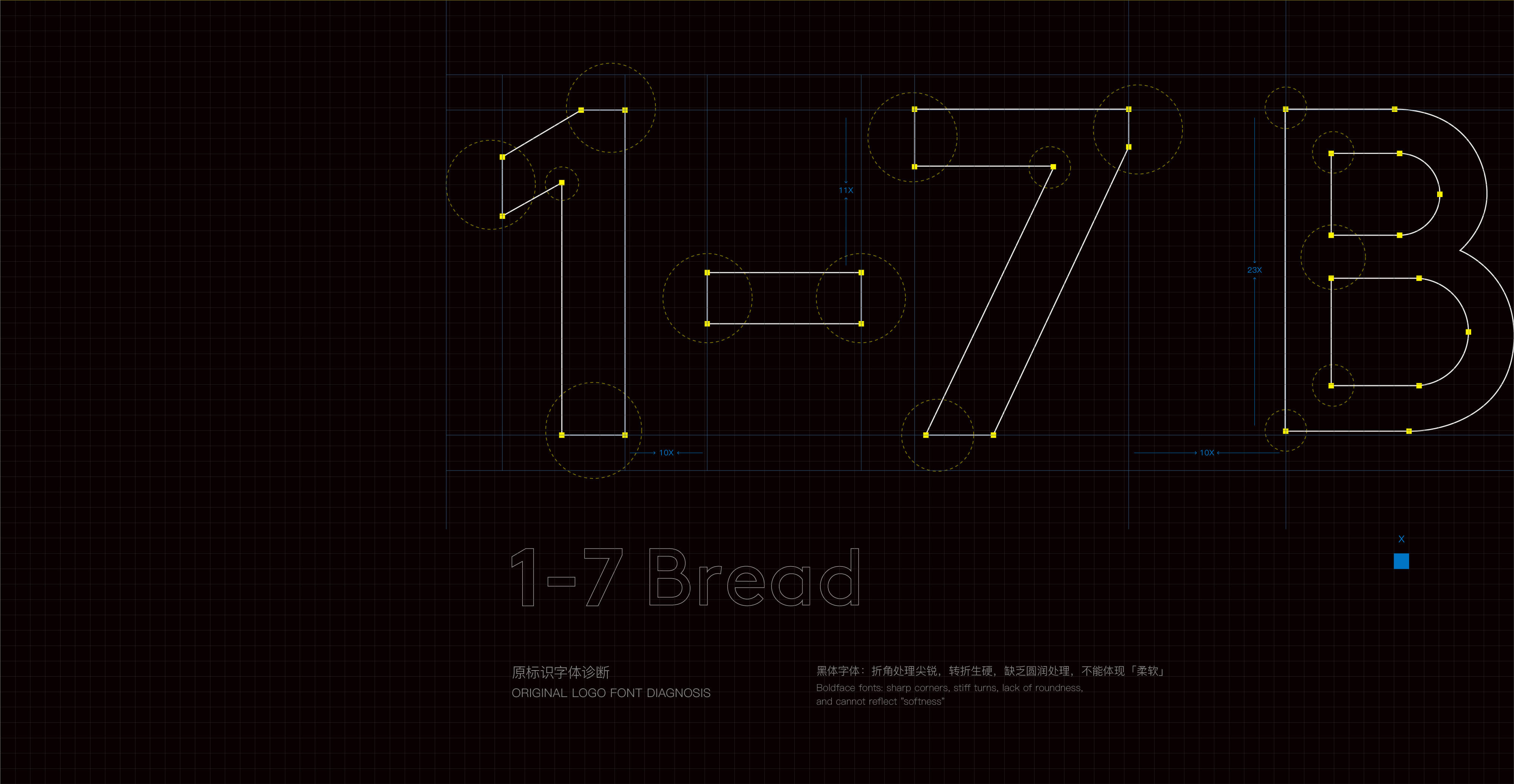
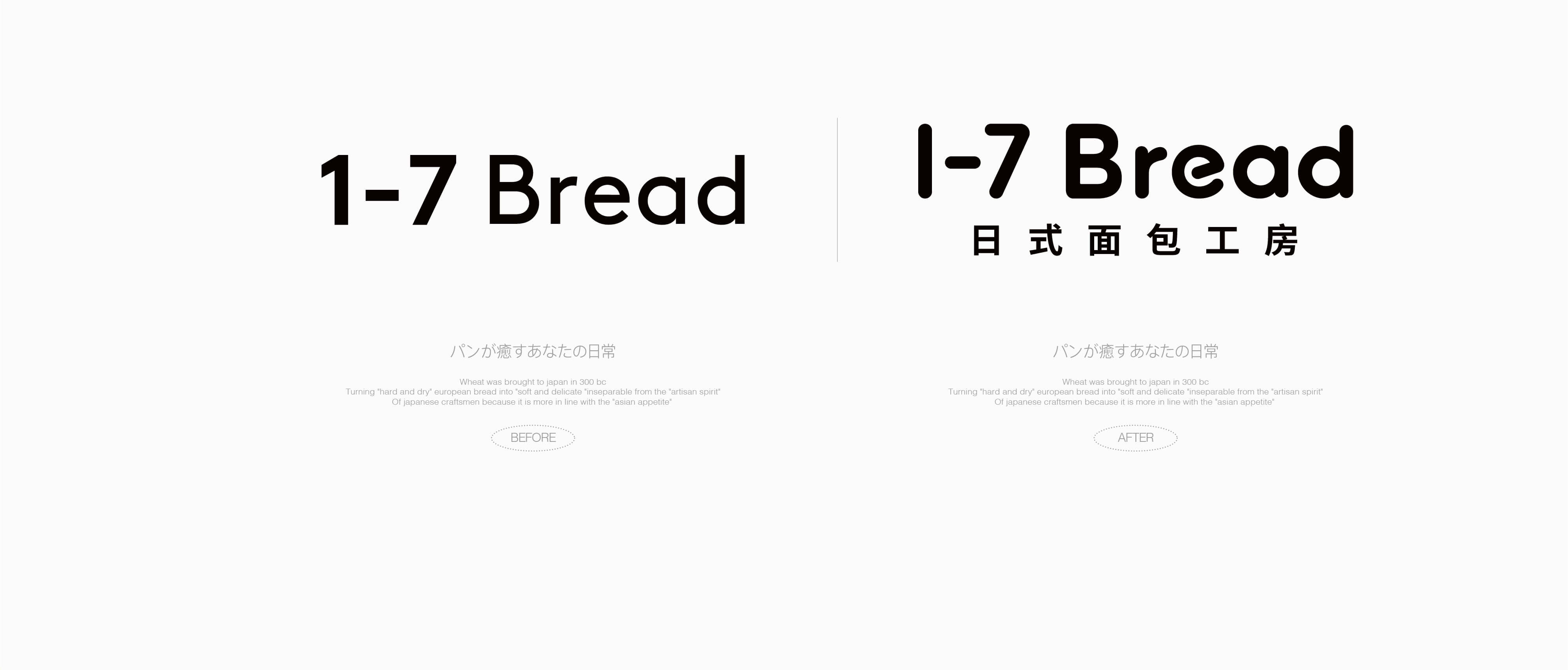
1-7Bread是创立于2018年的连锁烘培品牌。因前期只专注产品研发,忽略了品牌塑造,导致品牌虽然生意不错,但在深圳名气有限,陷入同质化竞争。此次品牌开级,至道品牌重点挖掘1-7Bread有力的品类定位——日式面包工房。不仅与其他品牌形成了竞争区隔,也为品牌开启了抢占细分品类——日式面包品类深圳代表品牌提供了良机。
1-7Bread is a chain bakery brand established in 2018. In the early days, it was solely focused on product development while overlooking brand building. As a result, despite its good business performance, the brand had limited popularity in Shenzhen and got caught in homogeneous competition.During this brand upgrade, Itari Brand focused on exploring the powerful category positioning of 1-7Bread: a Japanese-style bread workshop. This not only sets it apart from other brands in the competition but also presents a golden opportunity for the brand to dominate the niche category and become the representative brand of Japanese-style bread in Shenzhen.
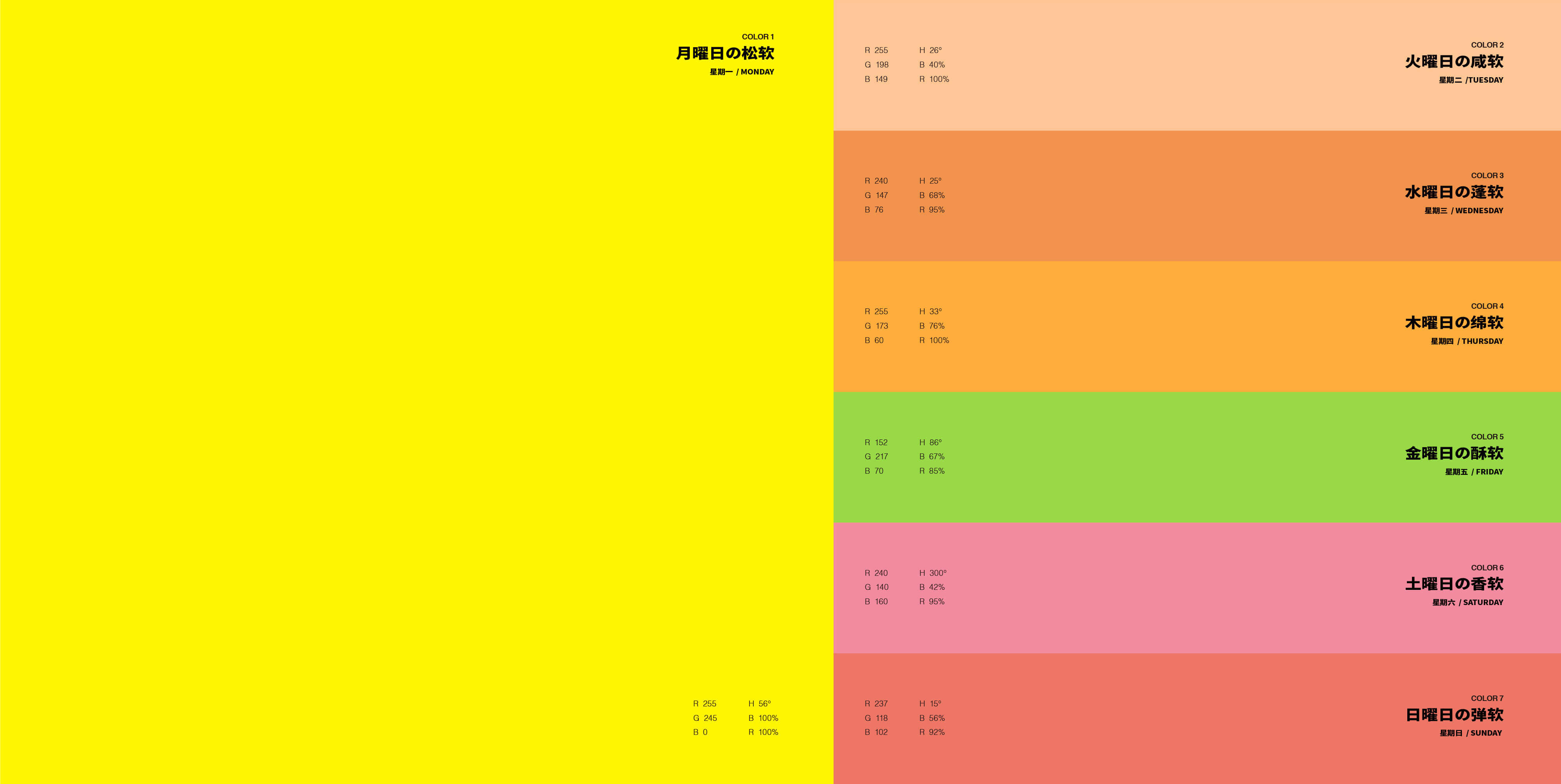
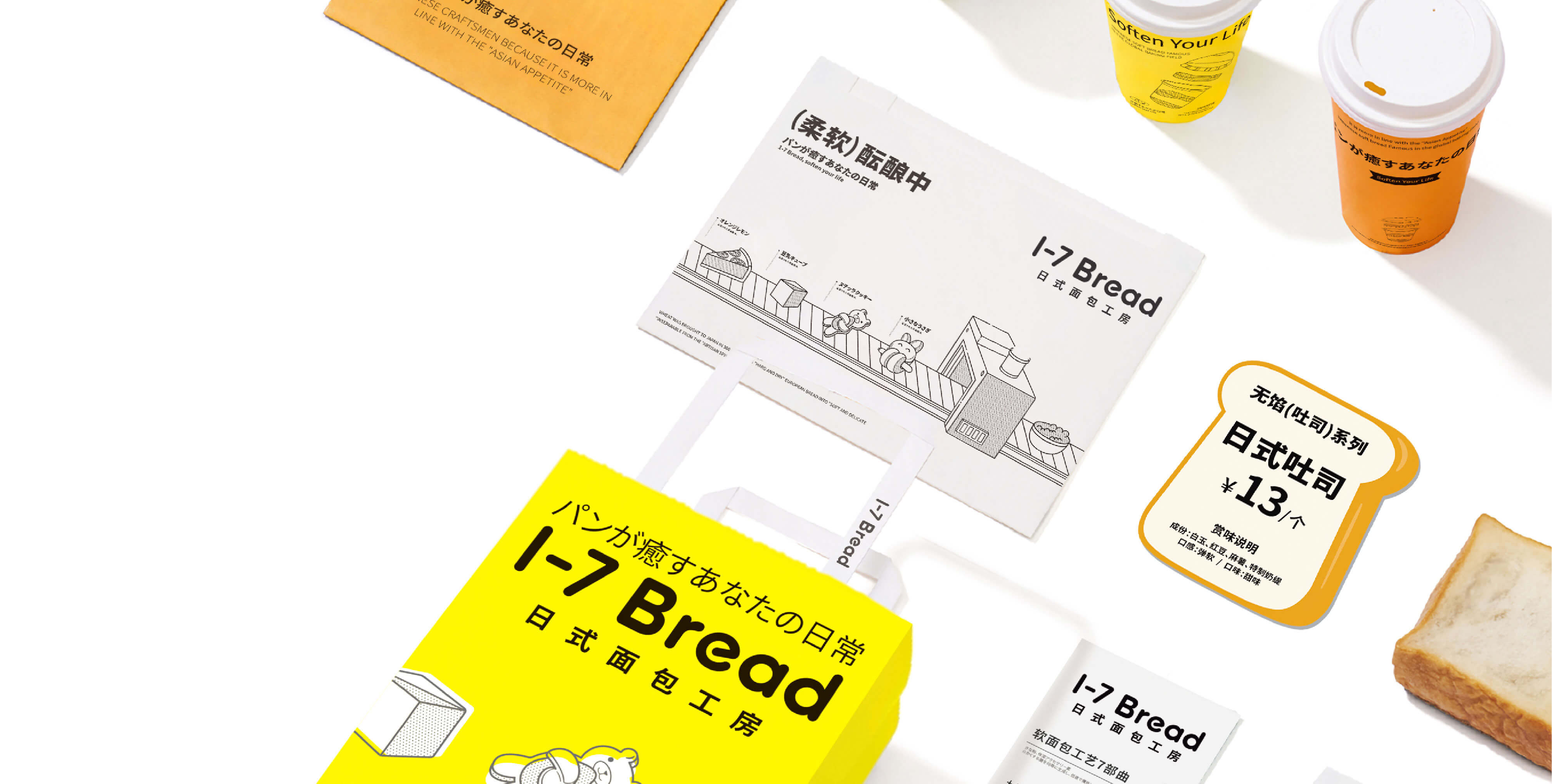

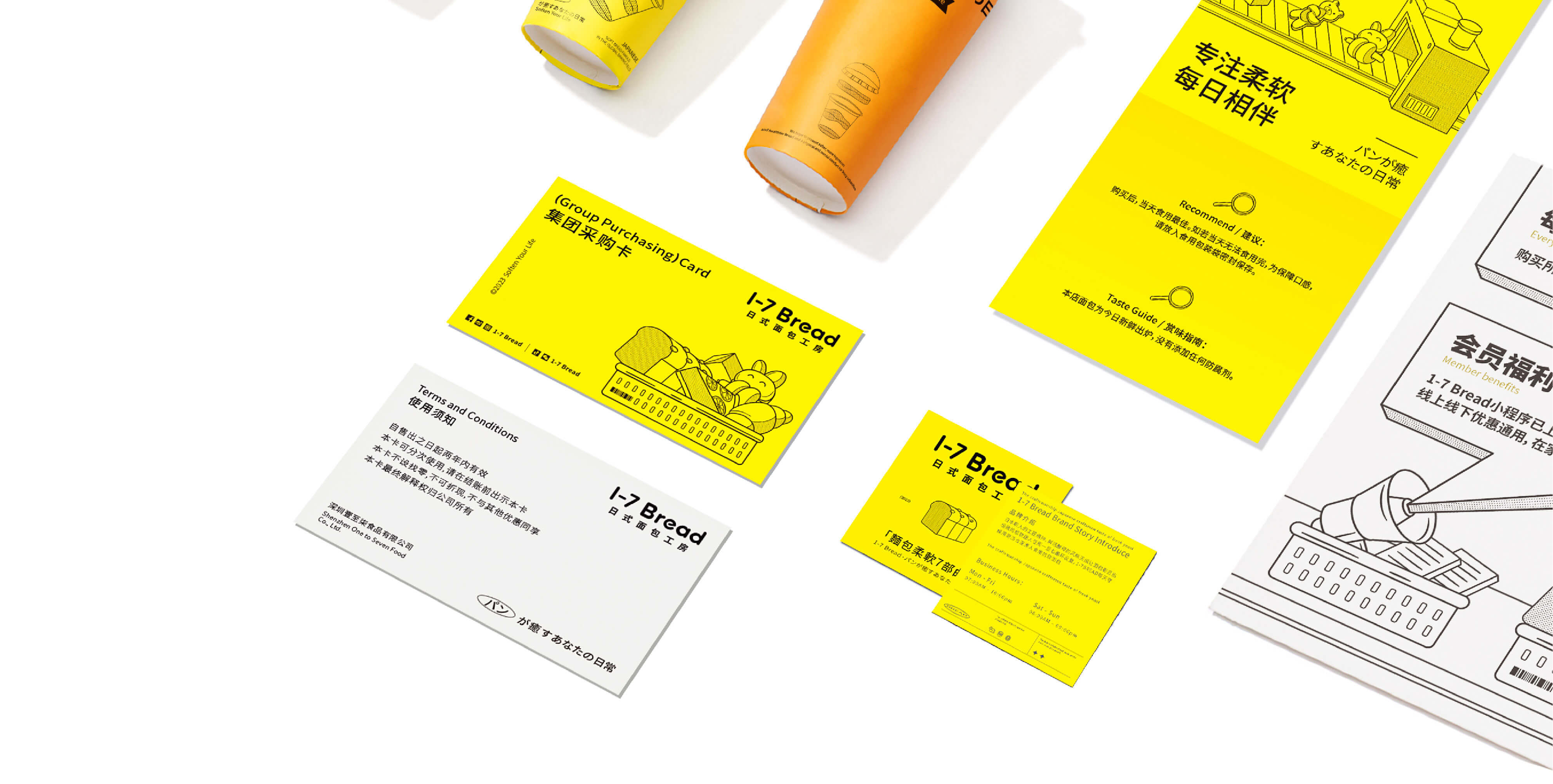
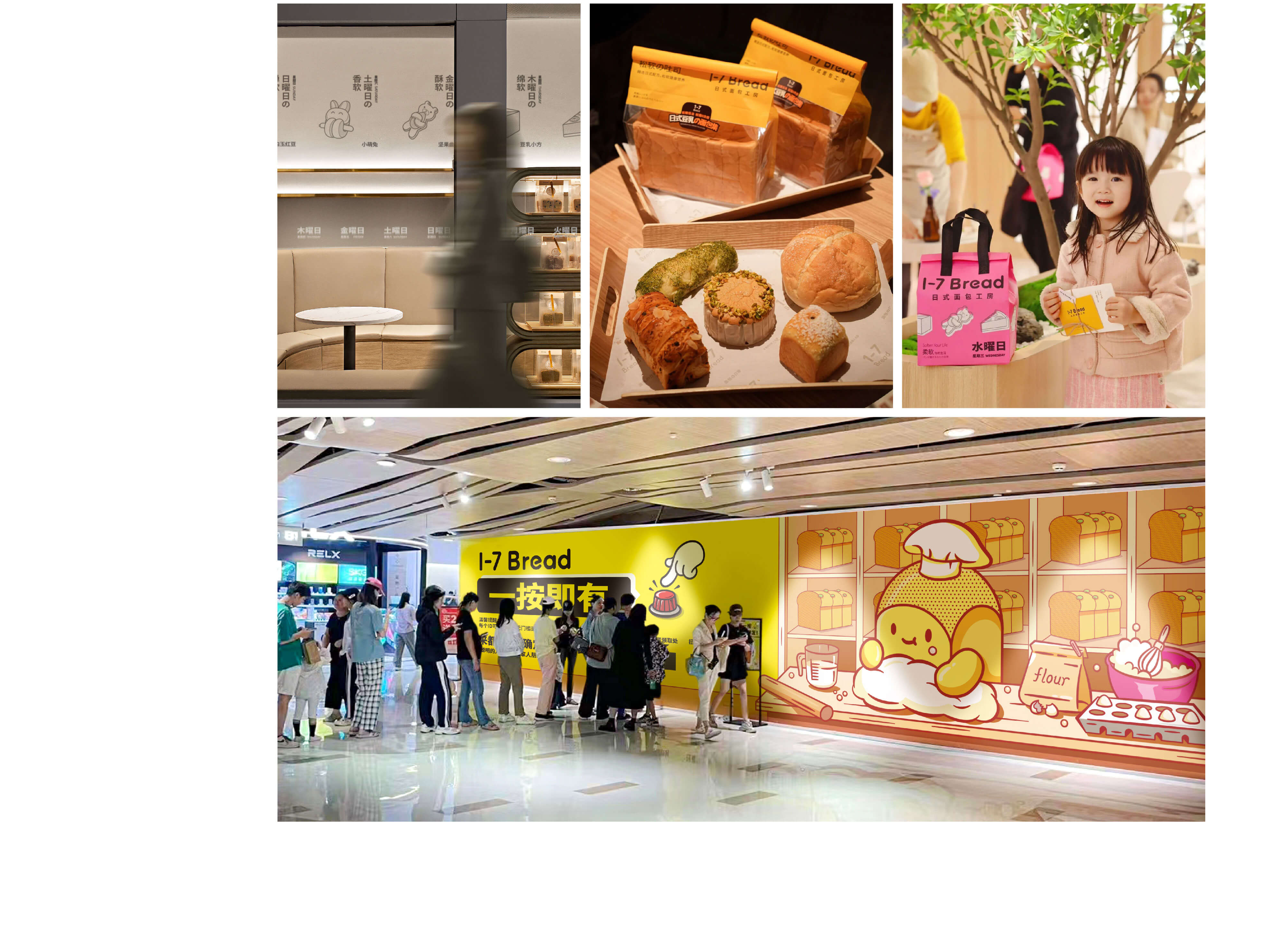
至道品牌在设计阶段,希望为消费者呈现1-7Bread作为都市人星期一至日的面包日常,我们破天荒地为品牌制定了7大超级色彩——每种品牌色彩分别对应一周中的每一天。这一创意让品牌在深圳市场掀起了不小的声浪——有消费者深圳为了凑齐1-7的面包打包袋,连续七天到店门店消费。只要看到颜色缤纷面包外带包装,大家就知道这是1-7Bread的品牌。
During the design phase, Itari Brand aimed to present 1-7Bread to consumers as an everyday bread choice for urban dwellers from Monday to Sunday. Breakthroughly, we formulated seven super colors for the brand, with each color corresponding to a different day of the week. This creative idea generated quite a stir in the Shenzhen market. Some consumers in Shenzhen visited the store for seven consecutive days just to collect the bread packaging bags from Monday to Sunday. Whenever people see the colorful bread takeout packaging, they know it's the brand of 1-7Bread.

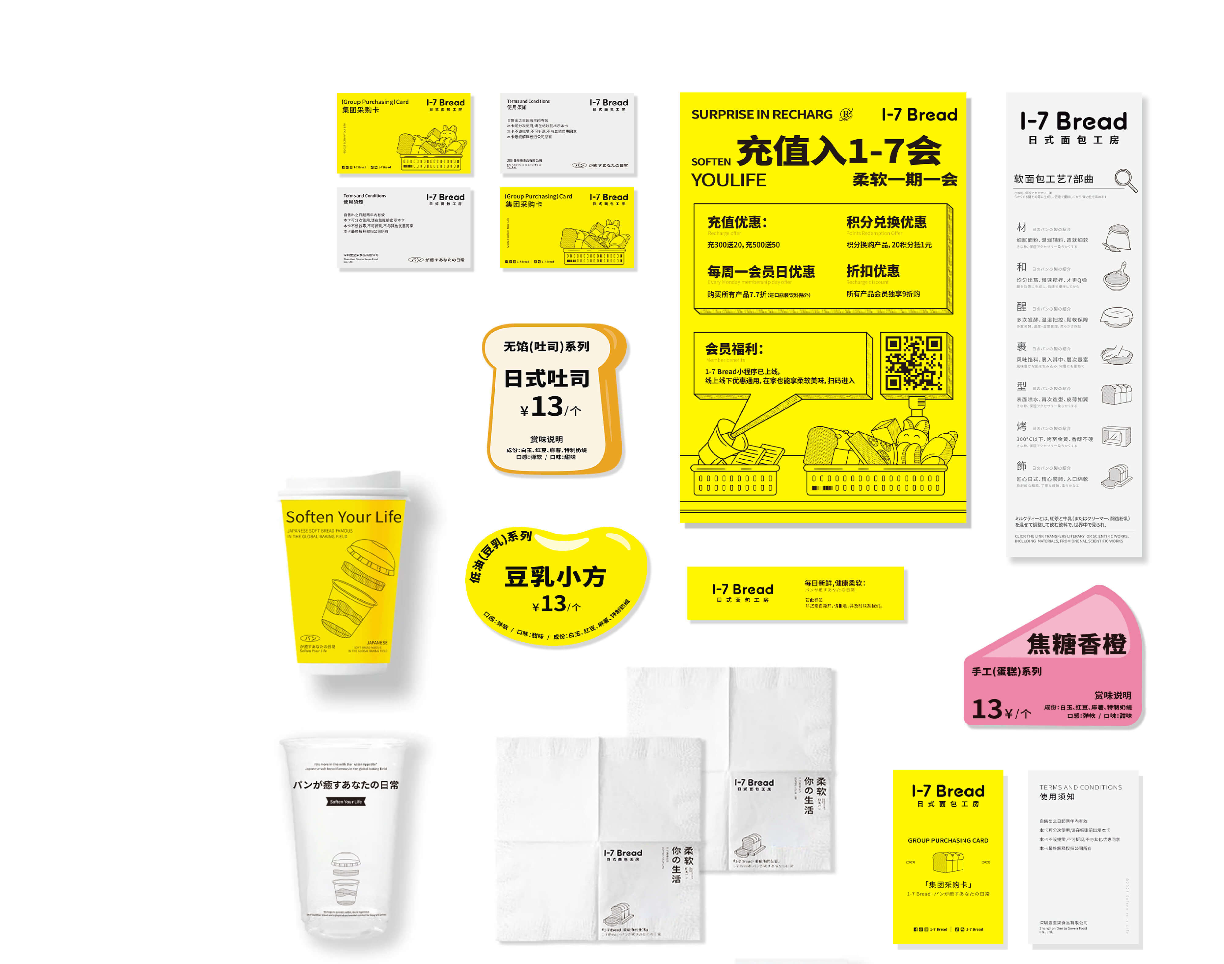
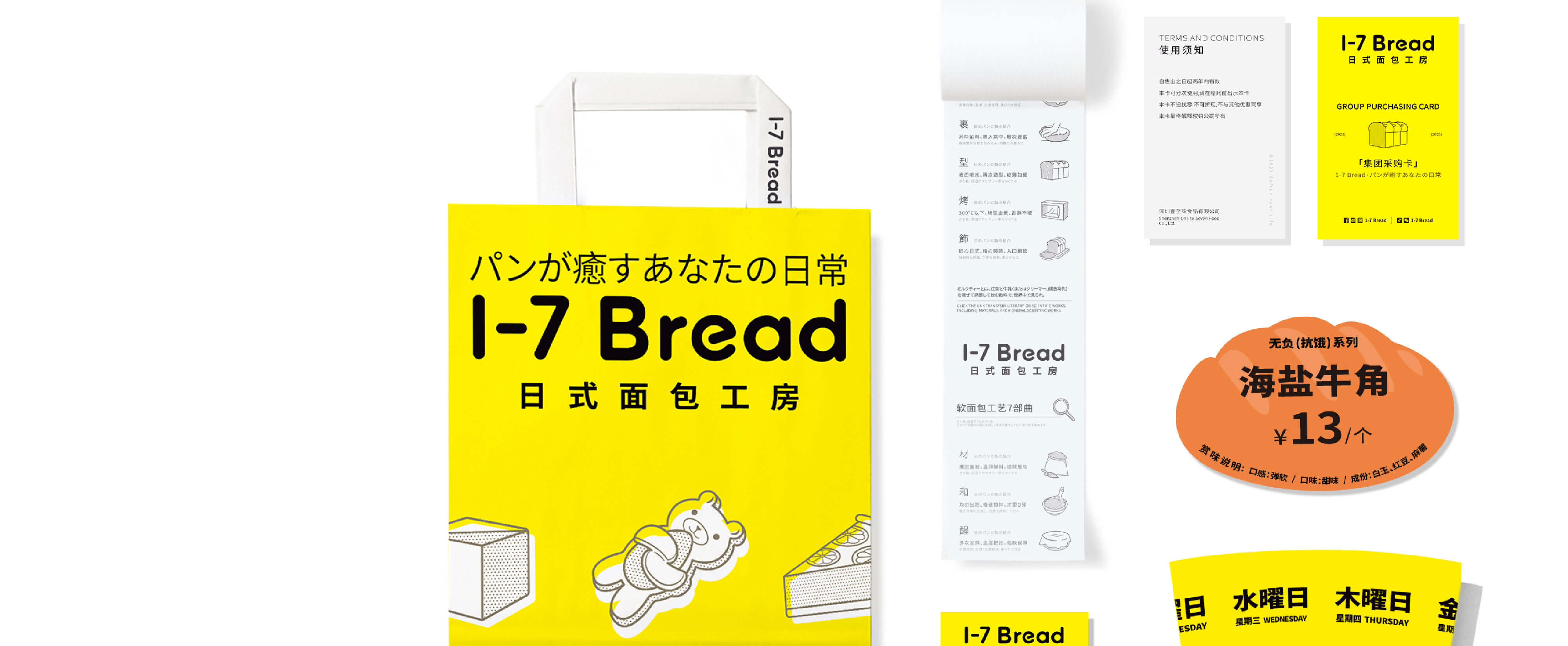
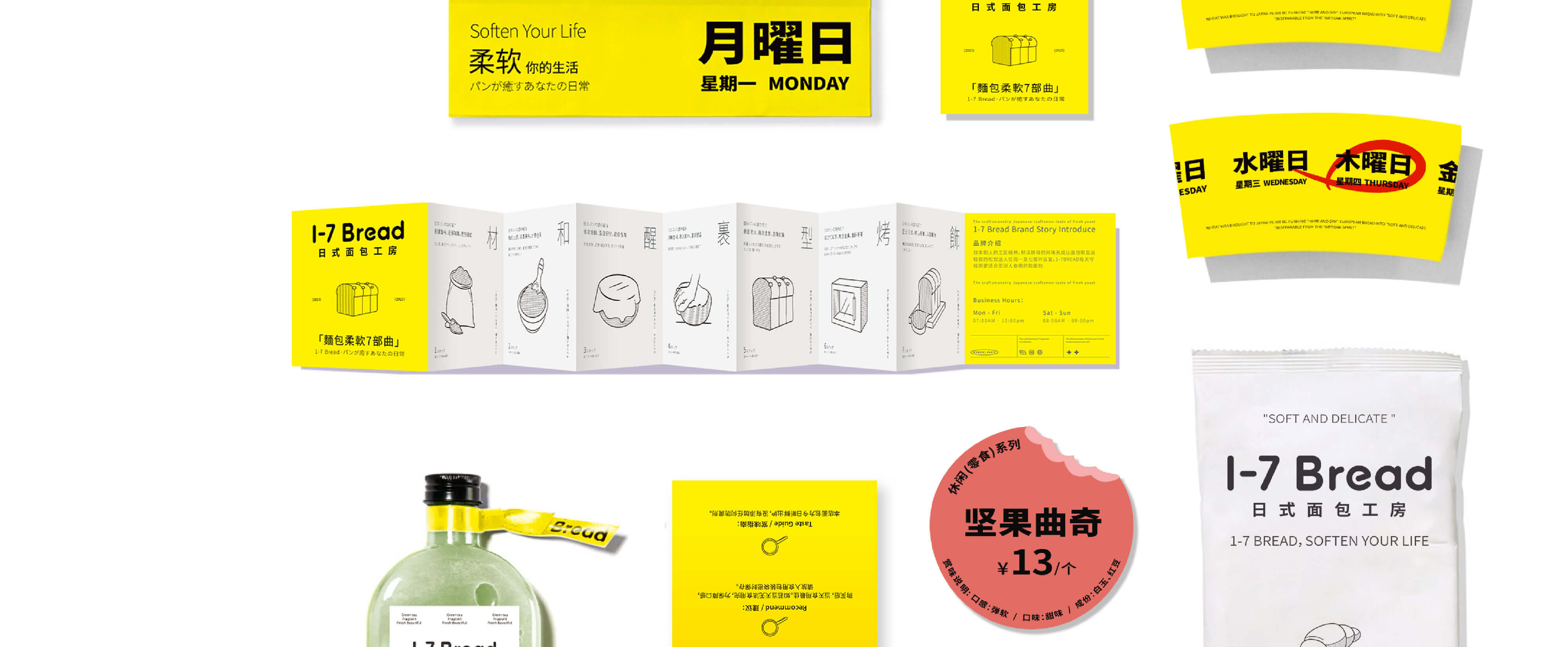

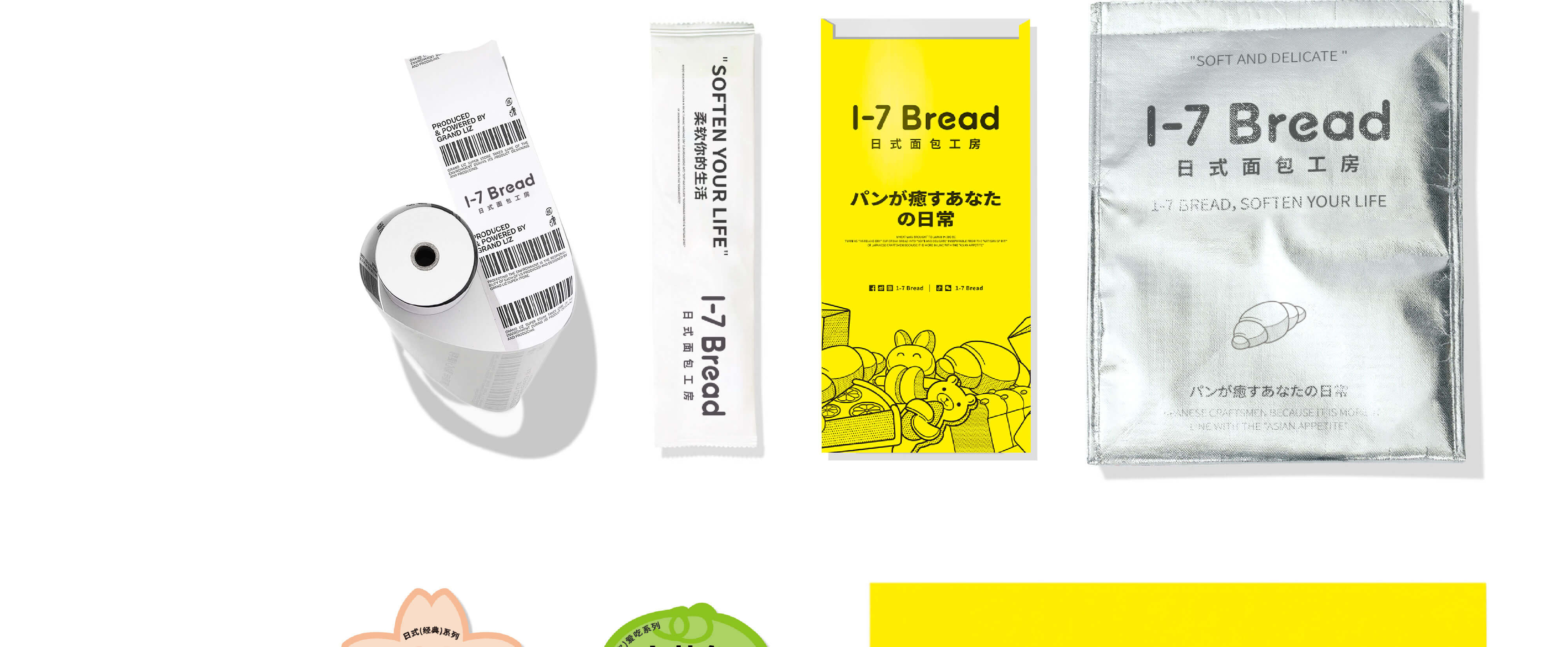
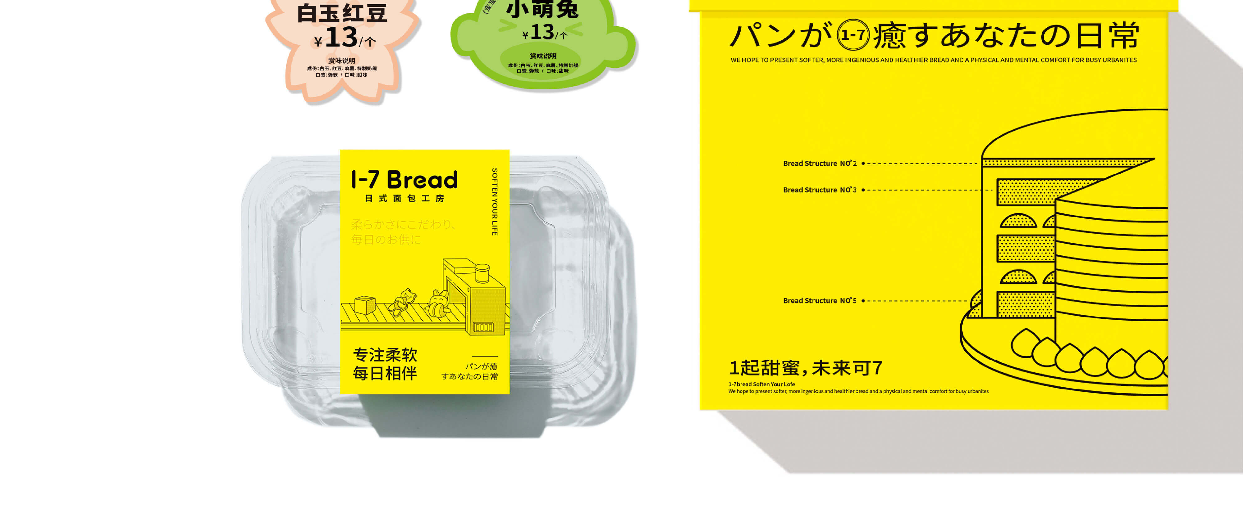
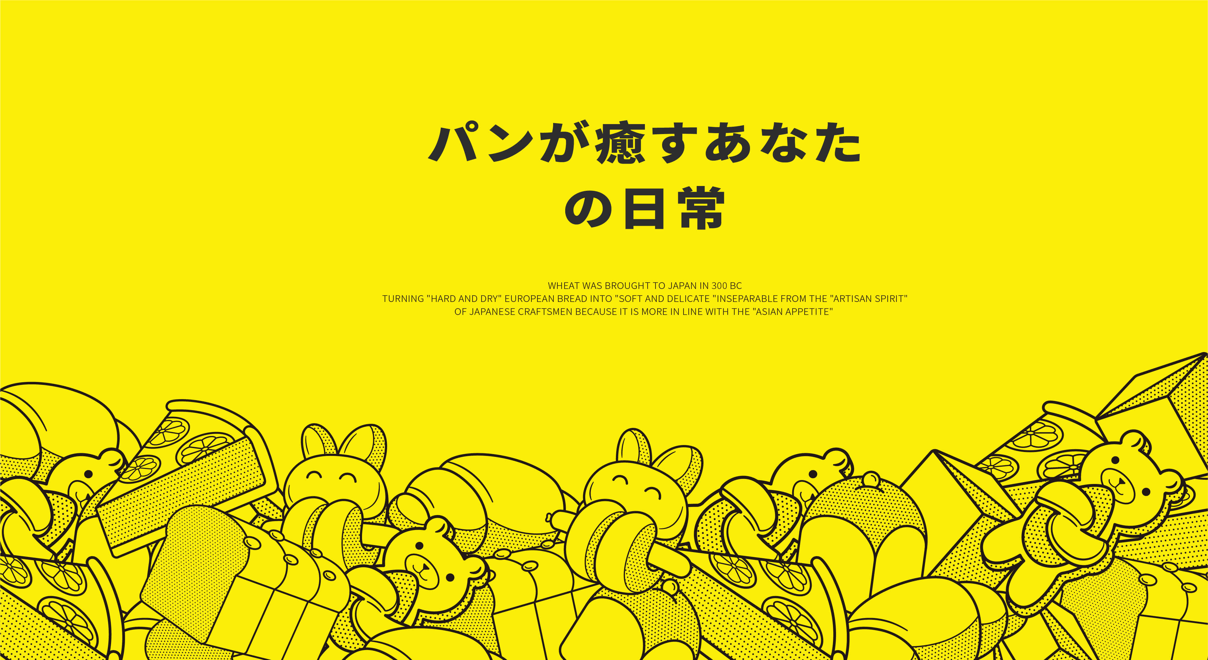
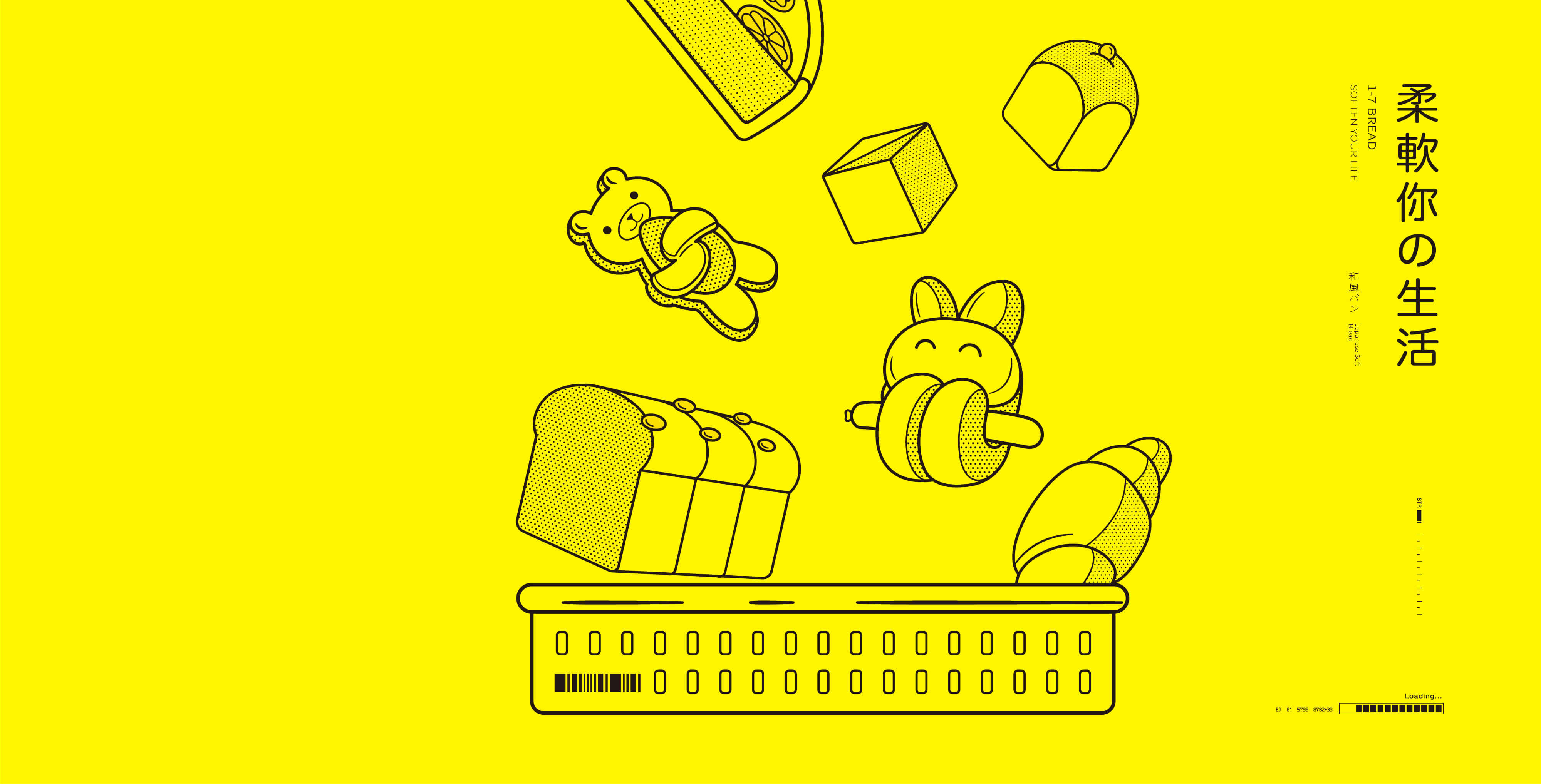
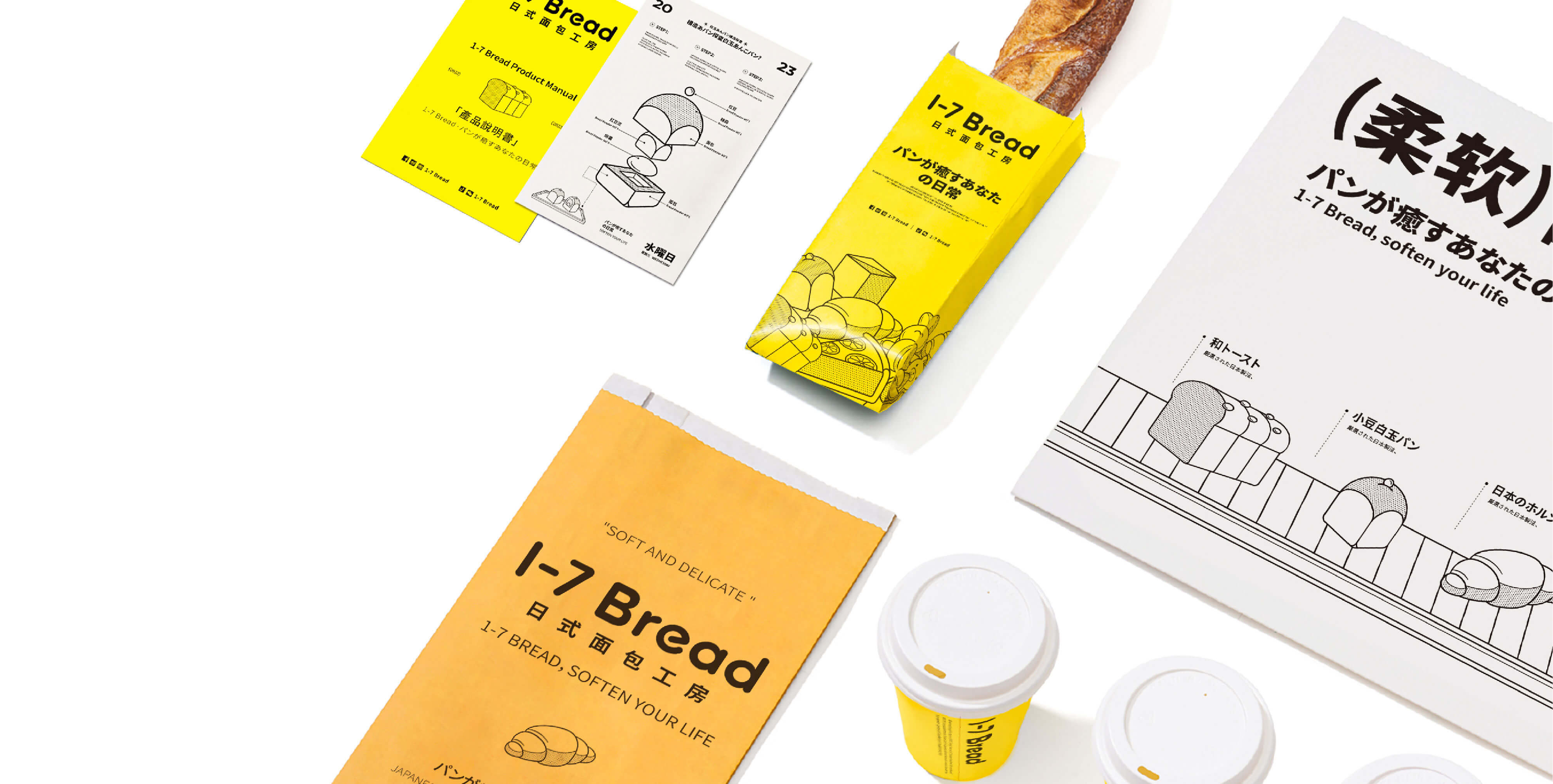
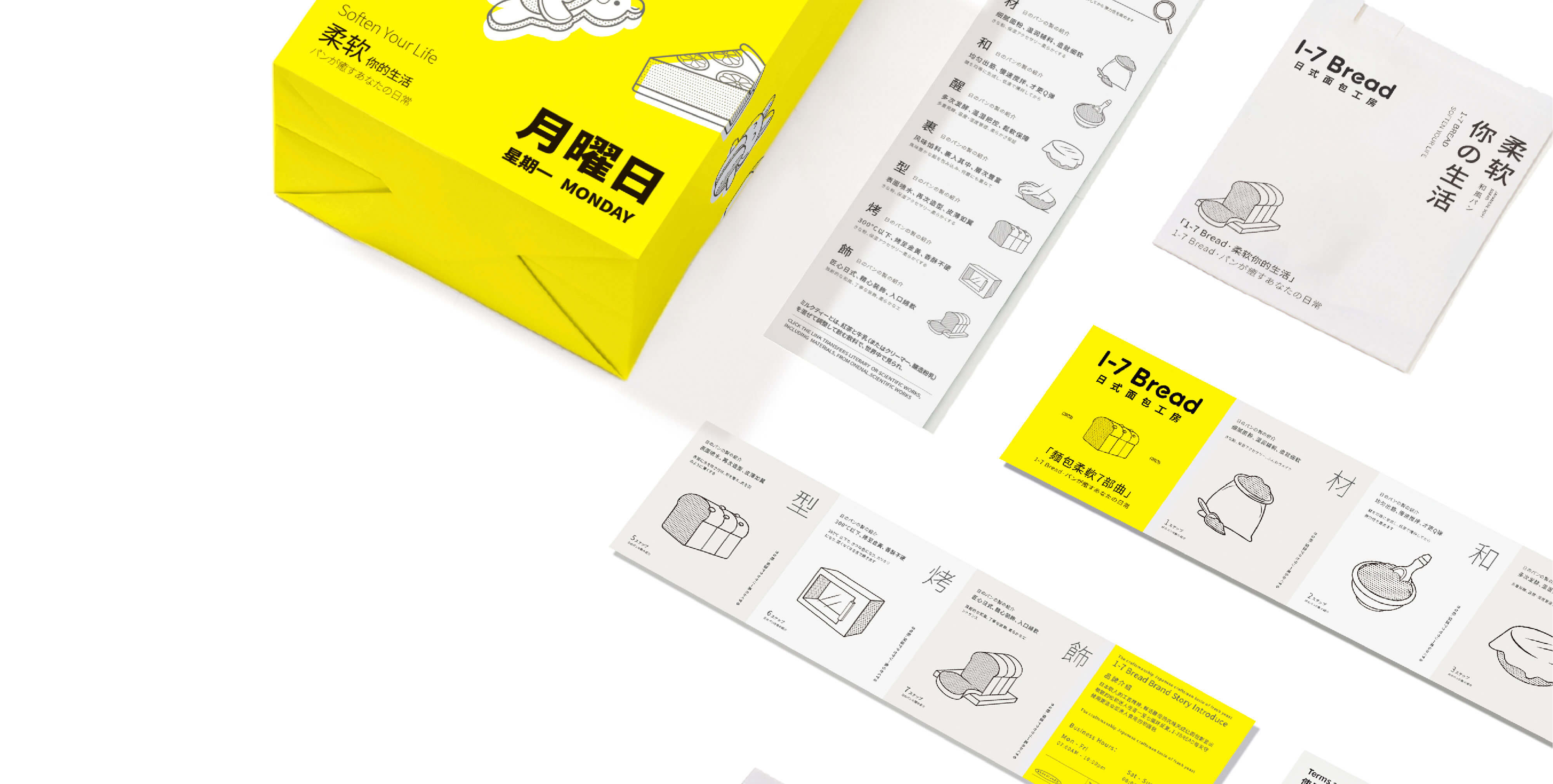
在视觉表达上,至道品牌将1-7Bread的极致产品主义与都市人对情绪价值的渴求相结合,采用现代美学手法,将品牌的七大爆款产品以「线条+波点」的可爱插画形式进行呈现。塑造属于1-7Bread专属的日式面包视觉体系。极具辨识度的色彩与元素组成超级视觉,帮助品牌在品类赛道的激烈竞争当中脱颖而出,成品深圳日式面包代表品牌。
In terms of visual expression, Itari Brand combines 1-7Bread's extreme product - centered concept with urban dwellers' desire for emotional value. By adopting modern aesthetic techniques, the brand's seven best - selling products are presented in the form of cute illustrations featuring "lines + polka dots". This creates a unique visual system for 1-7Bread's Japanese - style bread. The highly recognizable colors and elements form a super - visual identity, enabling the brand to stand out in the fierce competition within the category track and eventually become the representative brand of Japanese - style bread in Shenzhen.