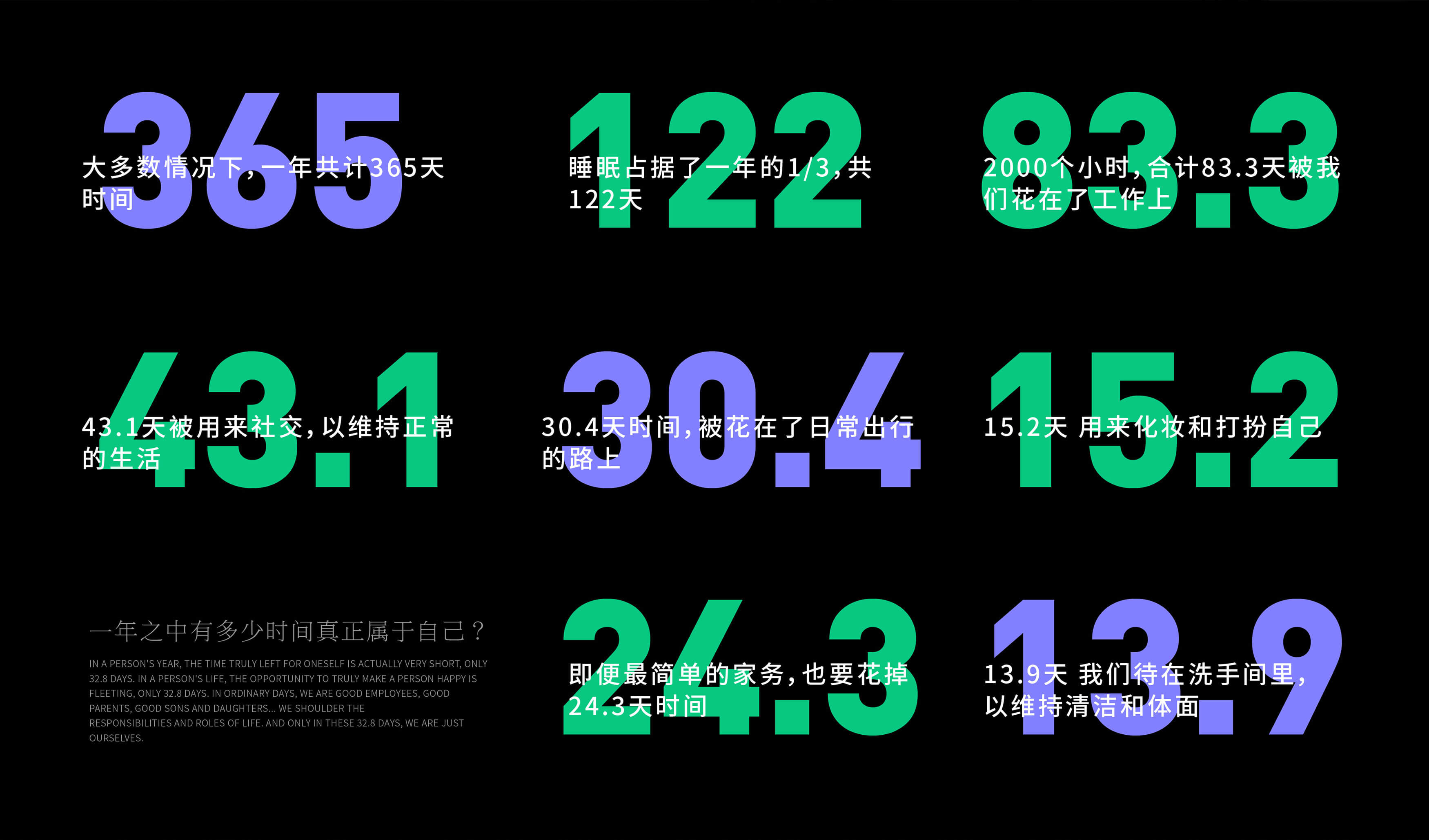
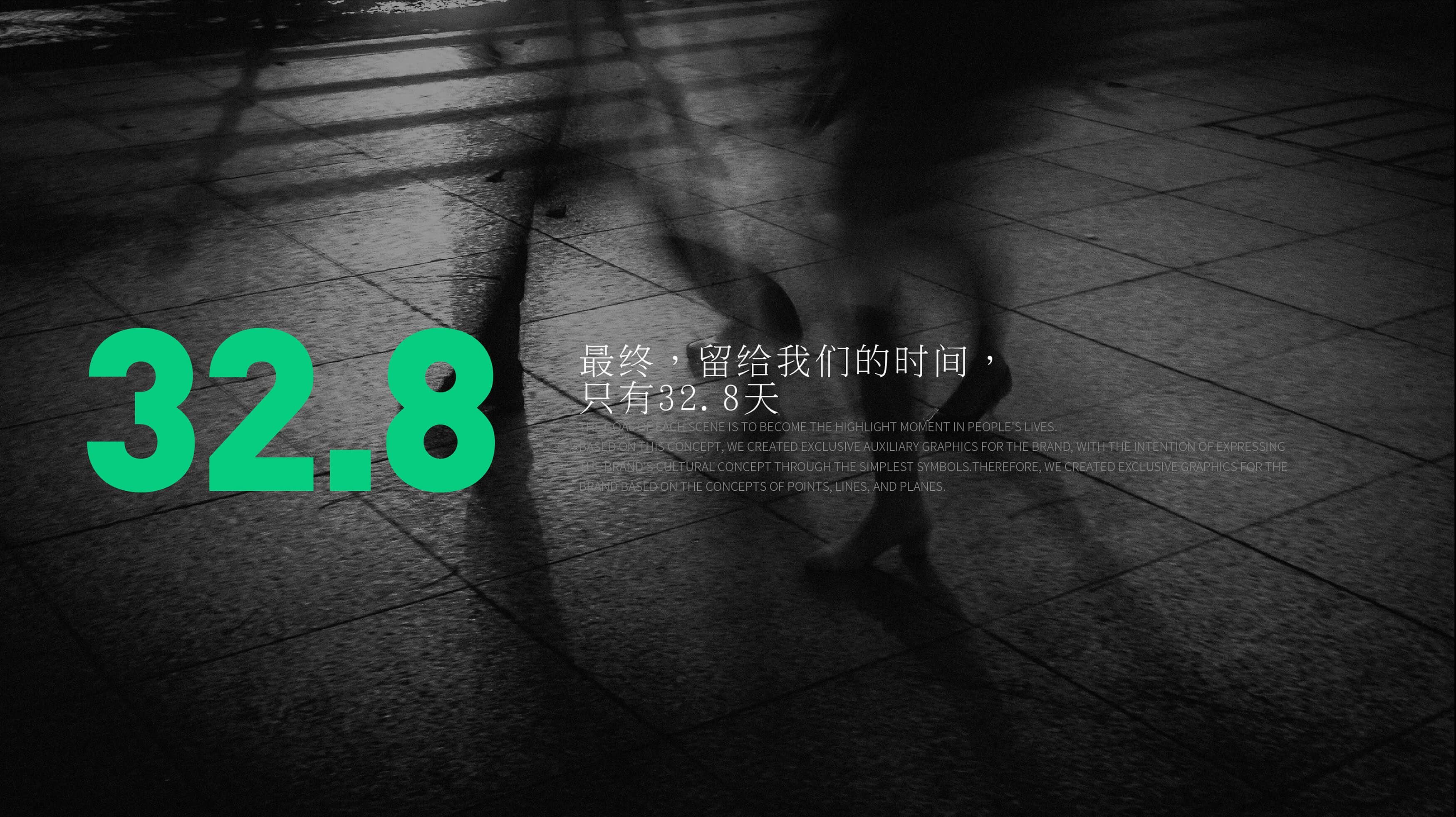
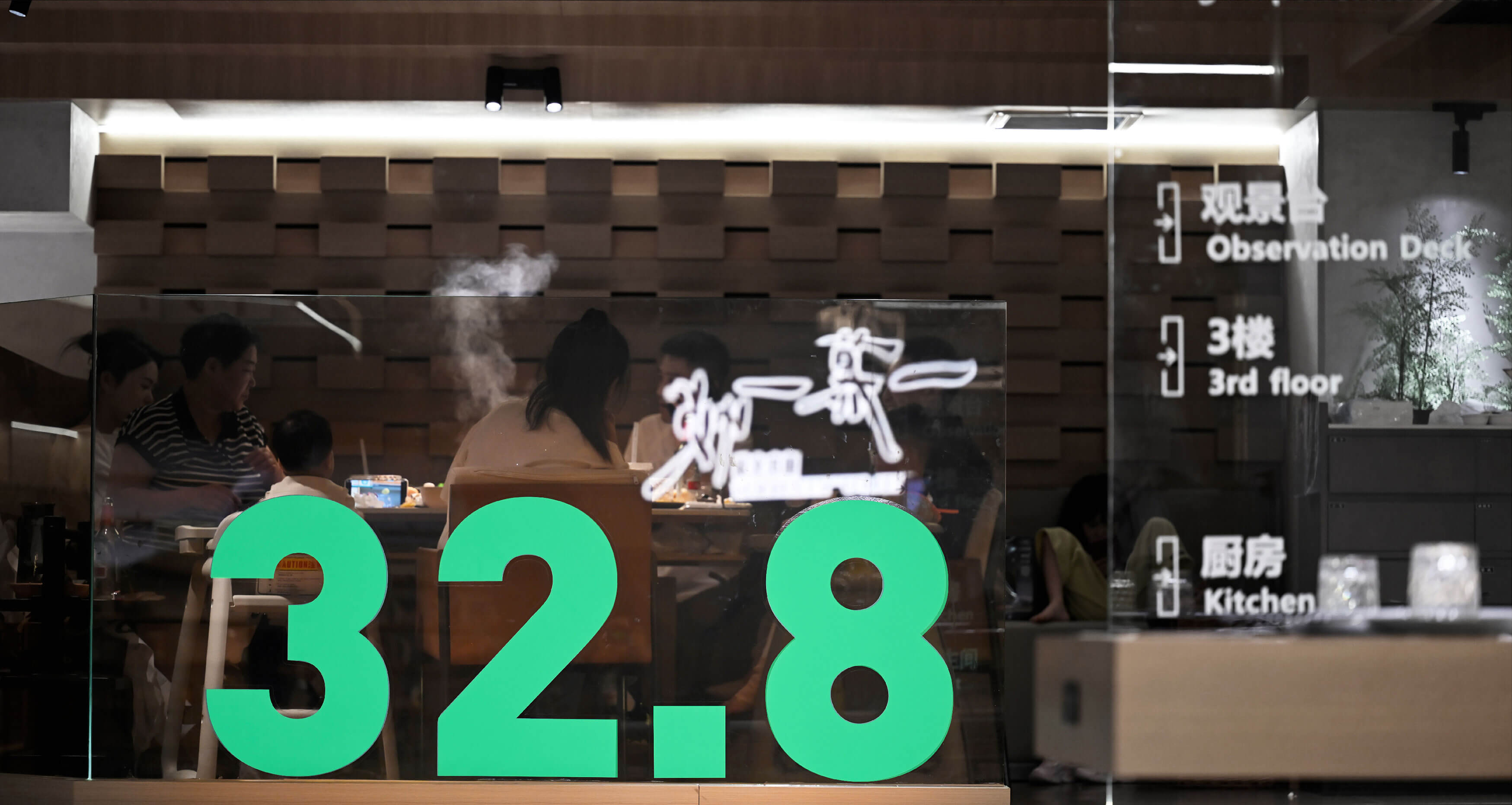
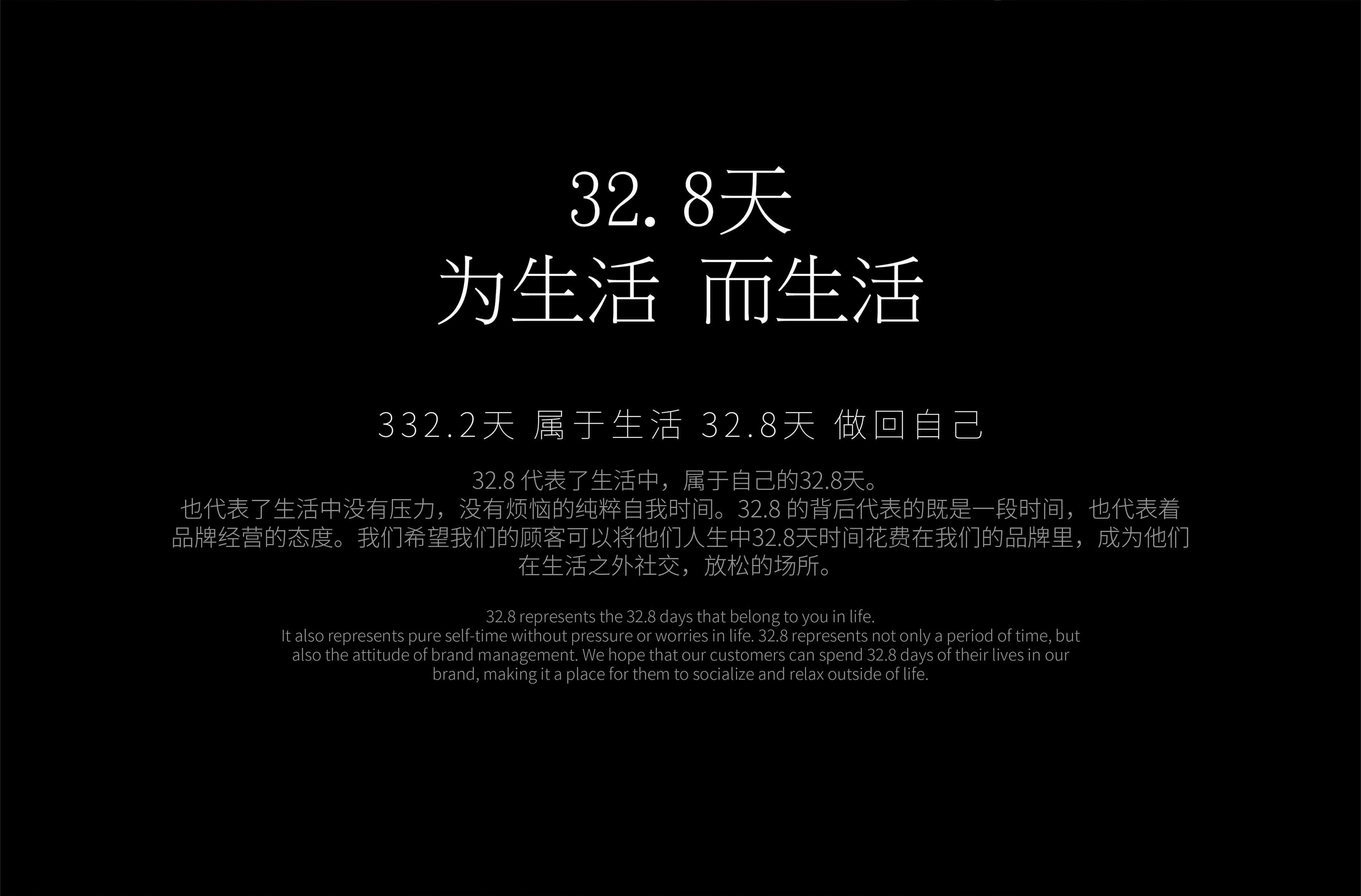
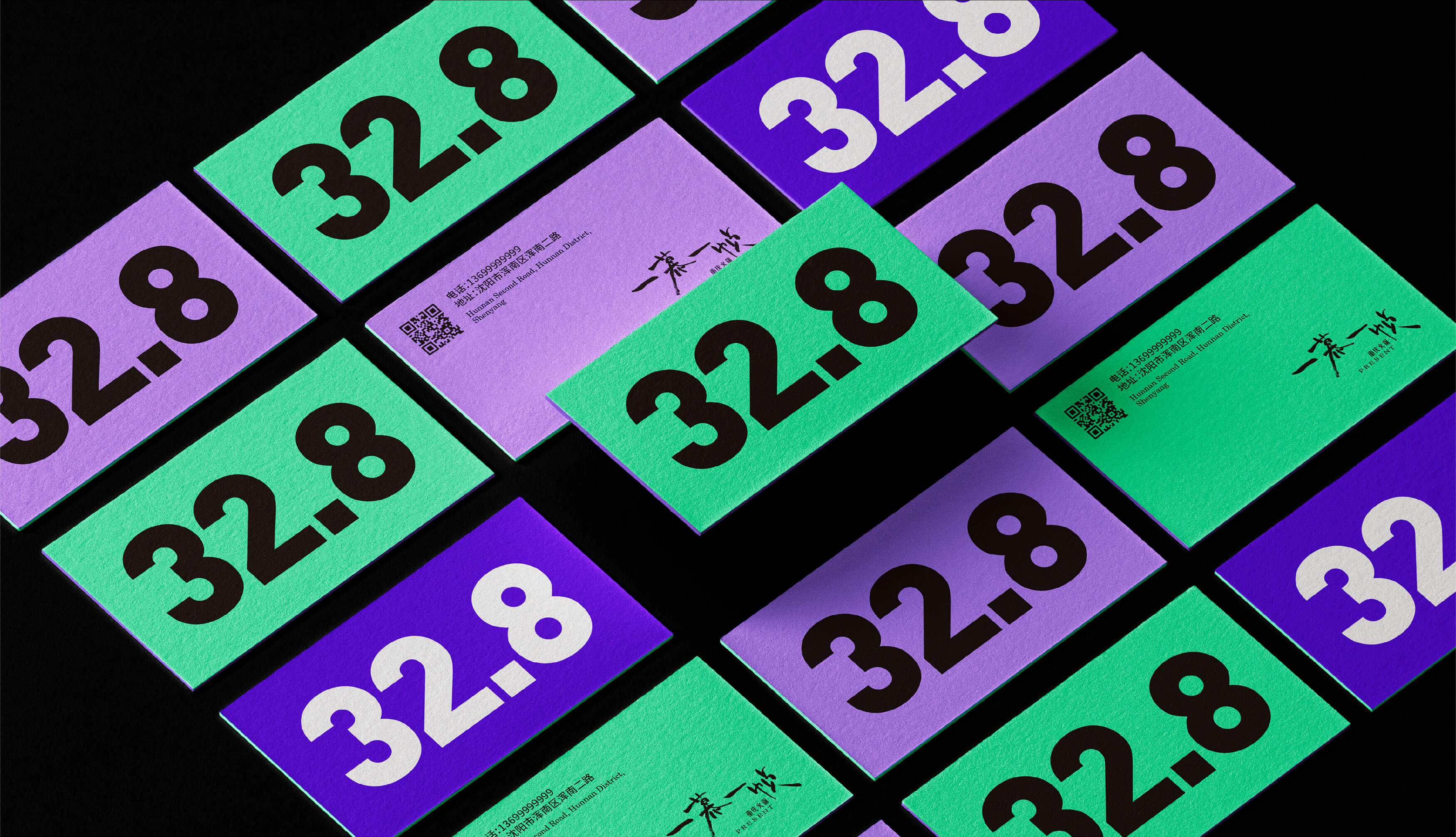
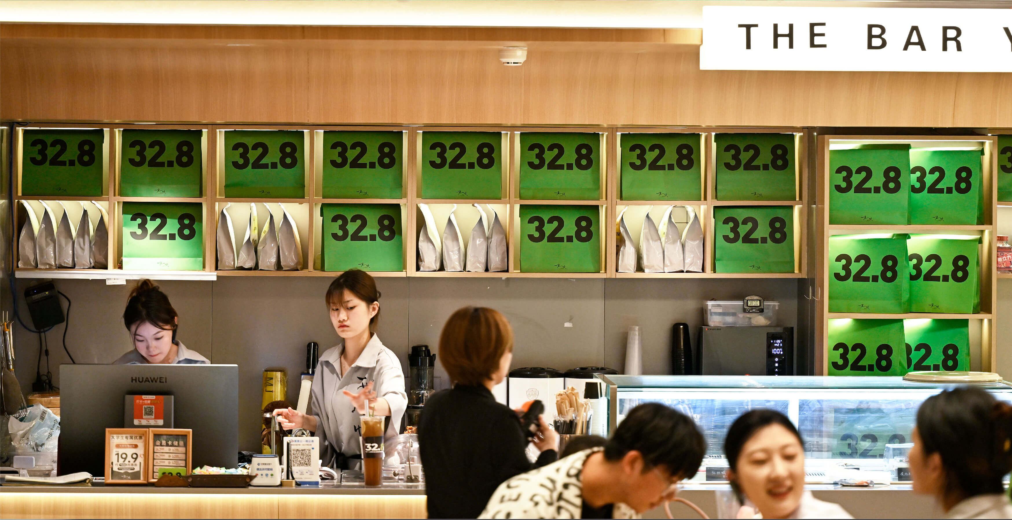
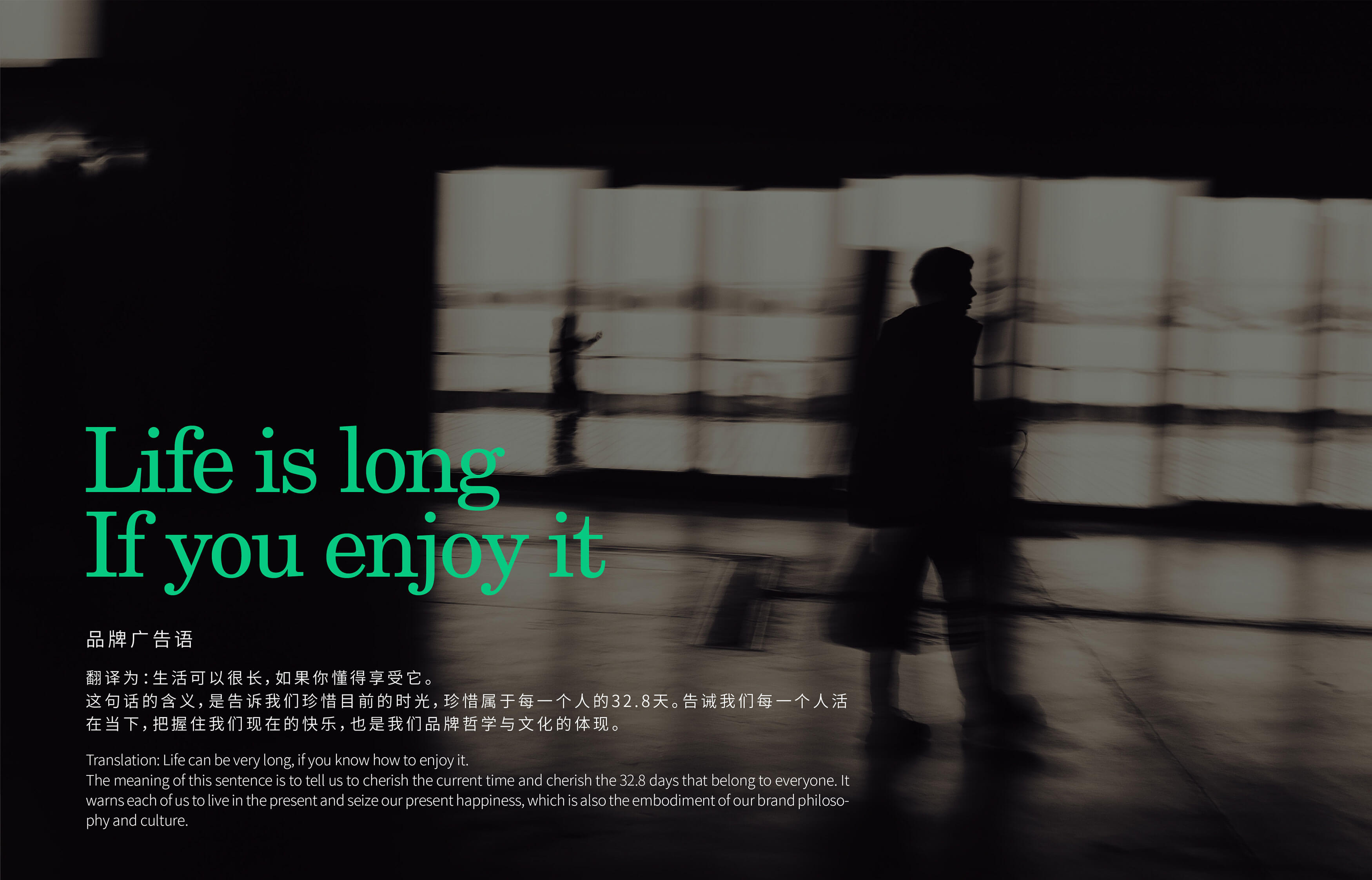
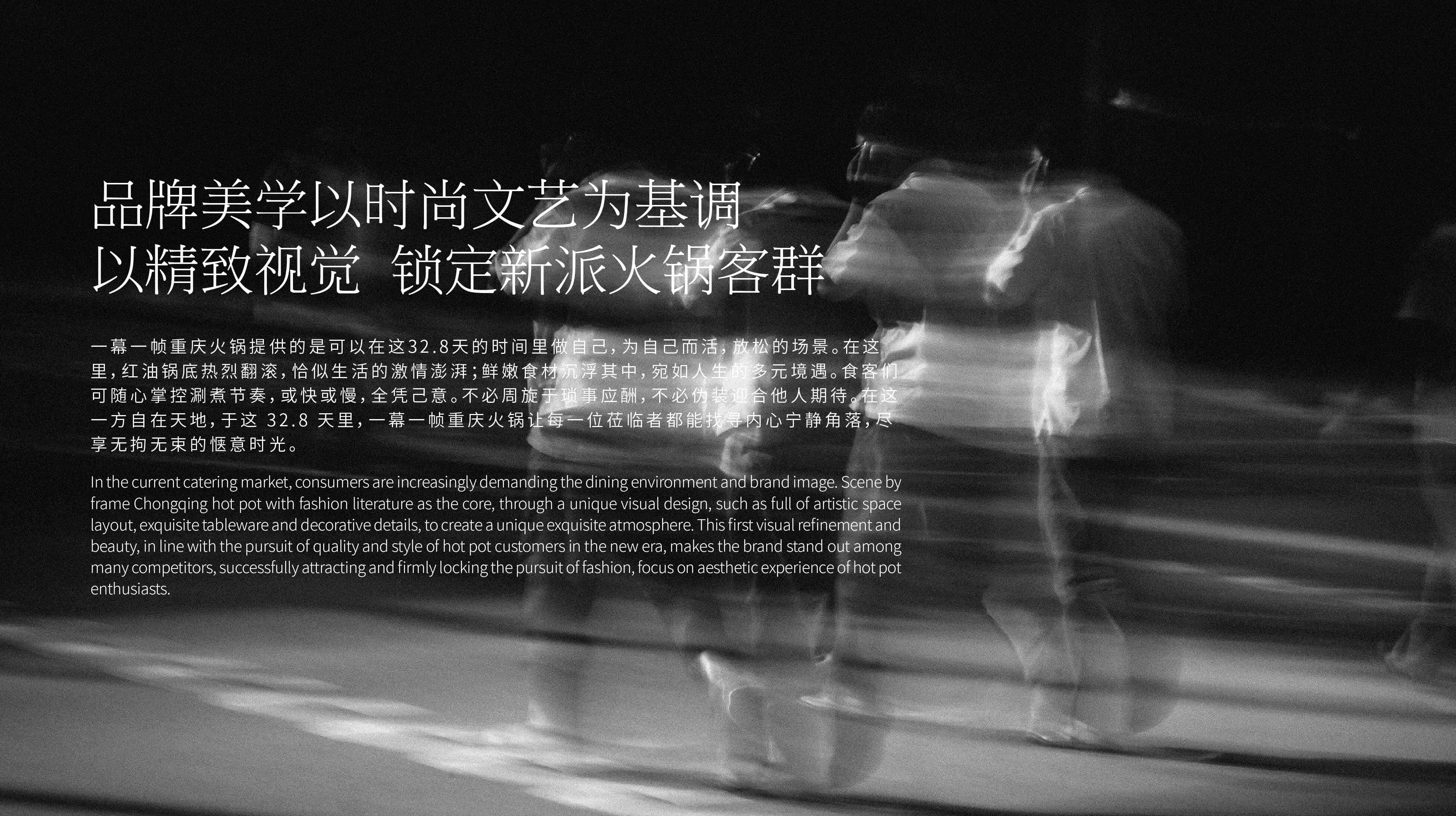
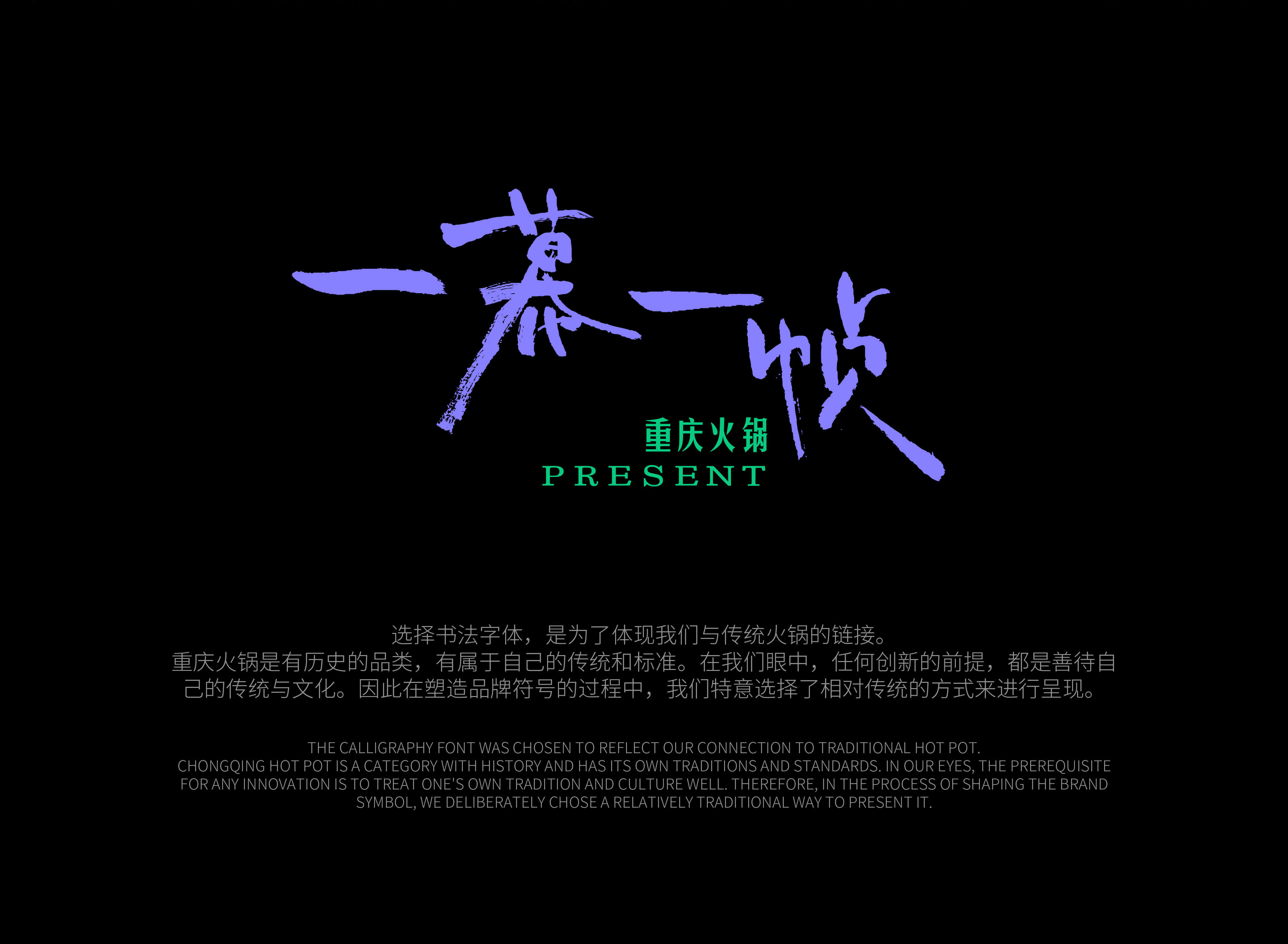
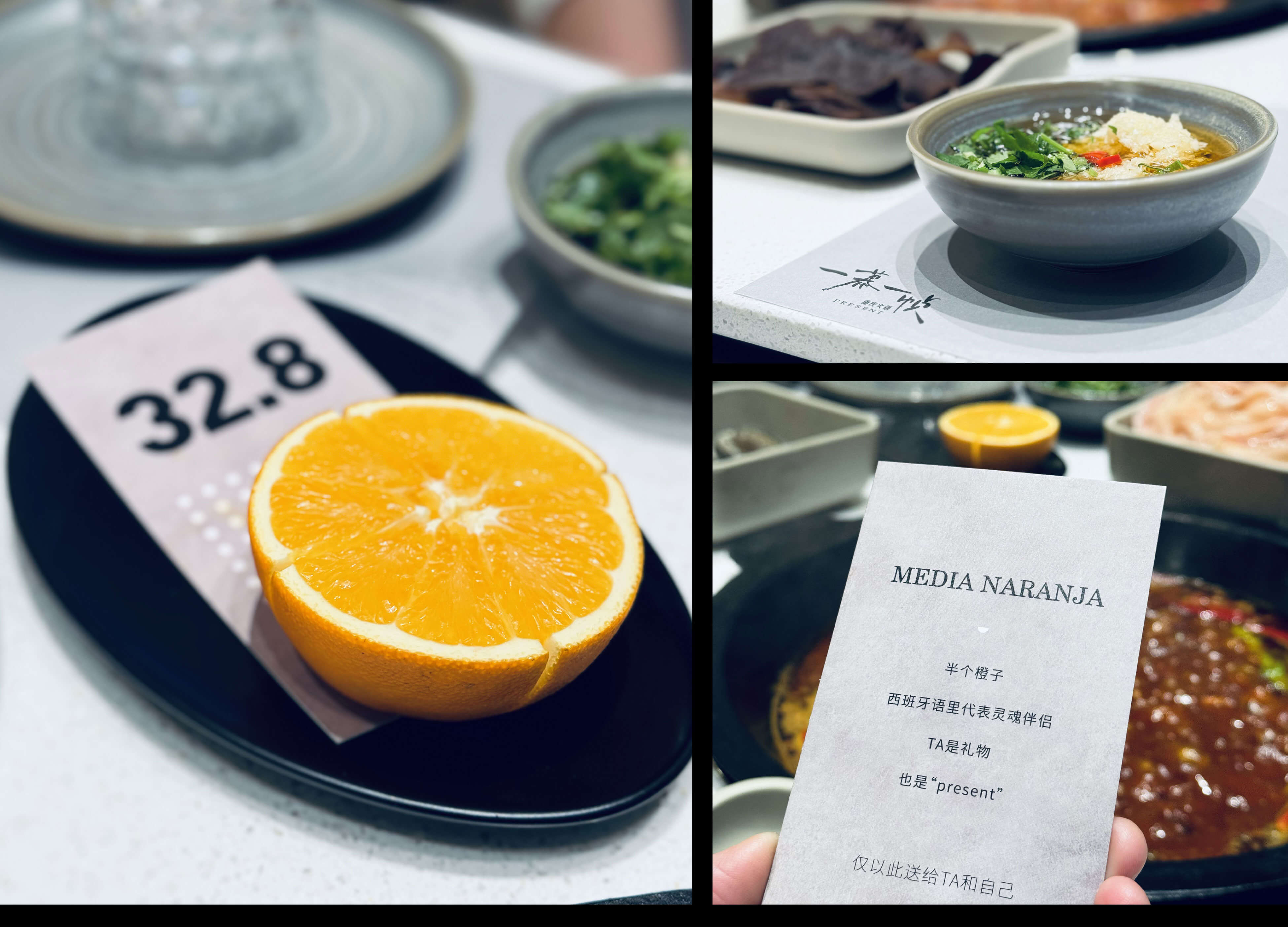
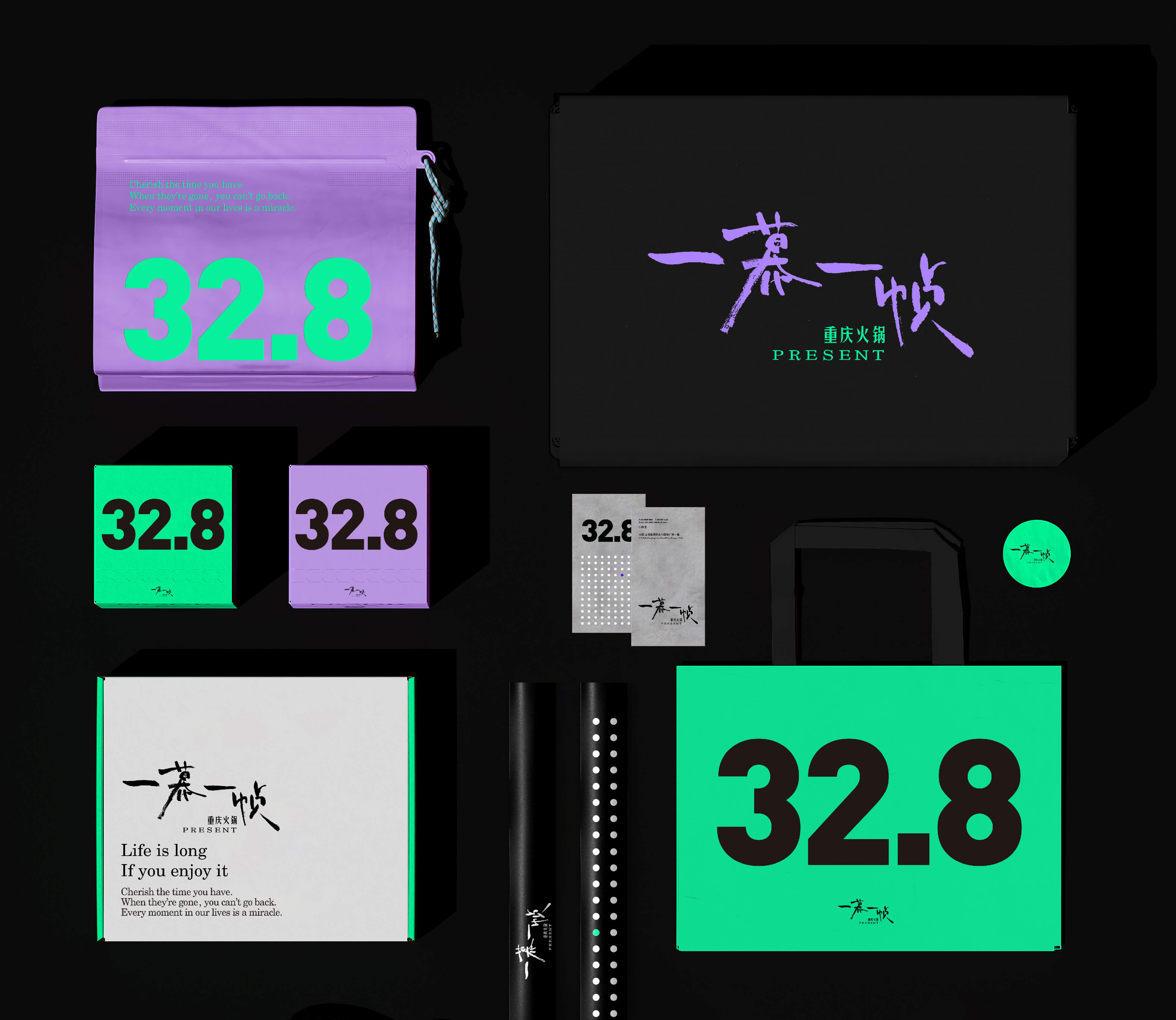
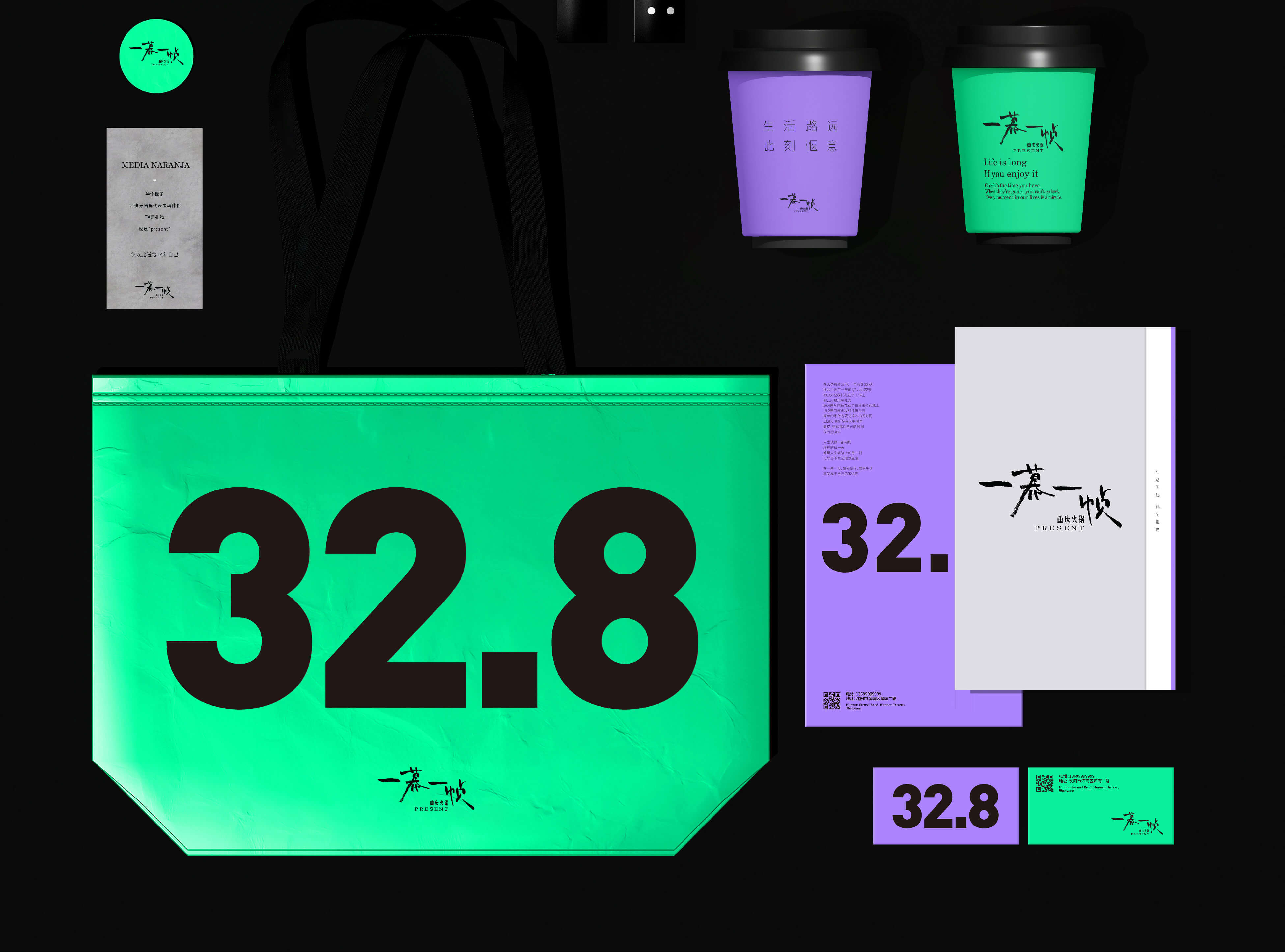
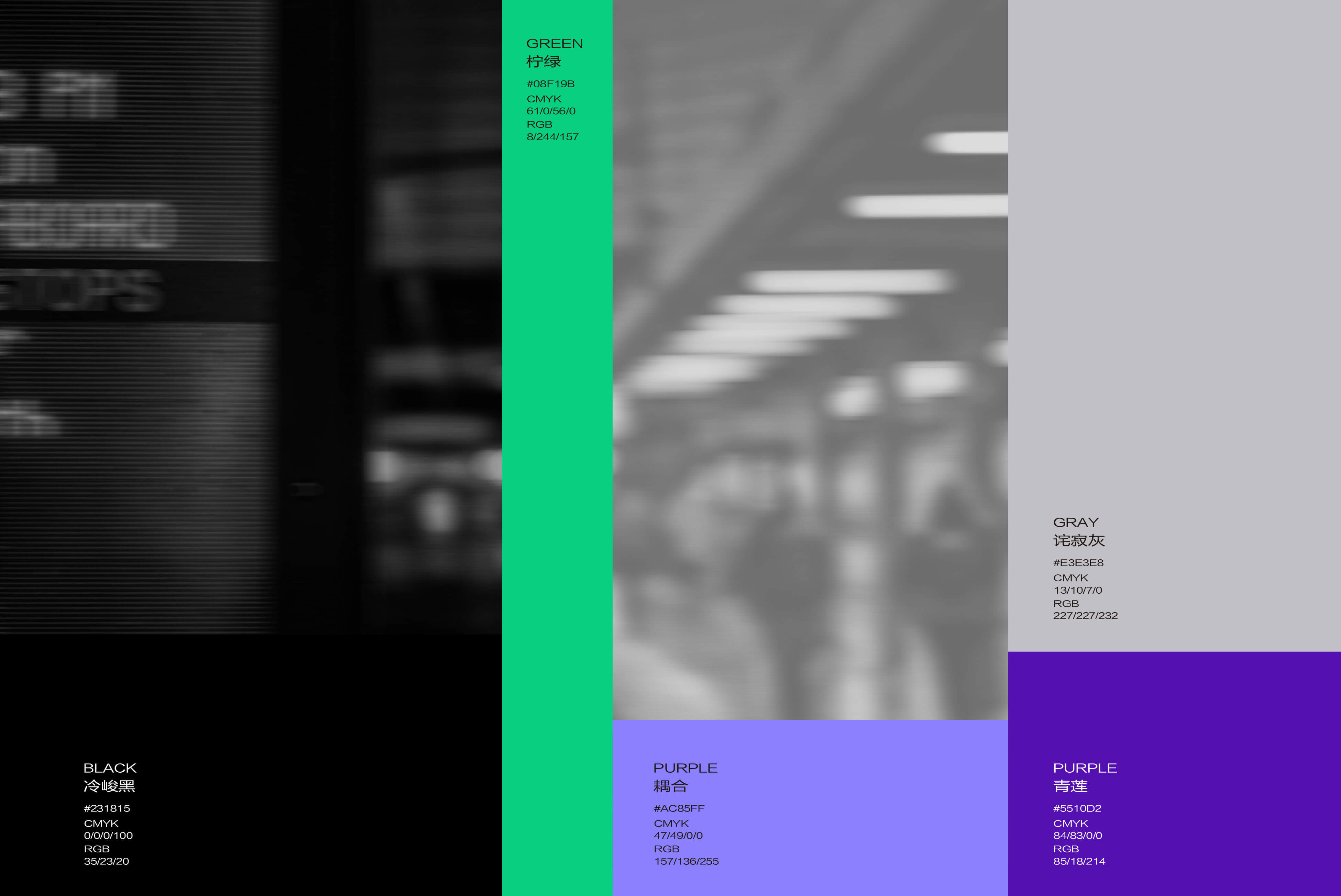
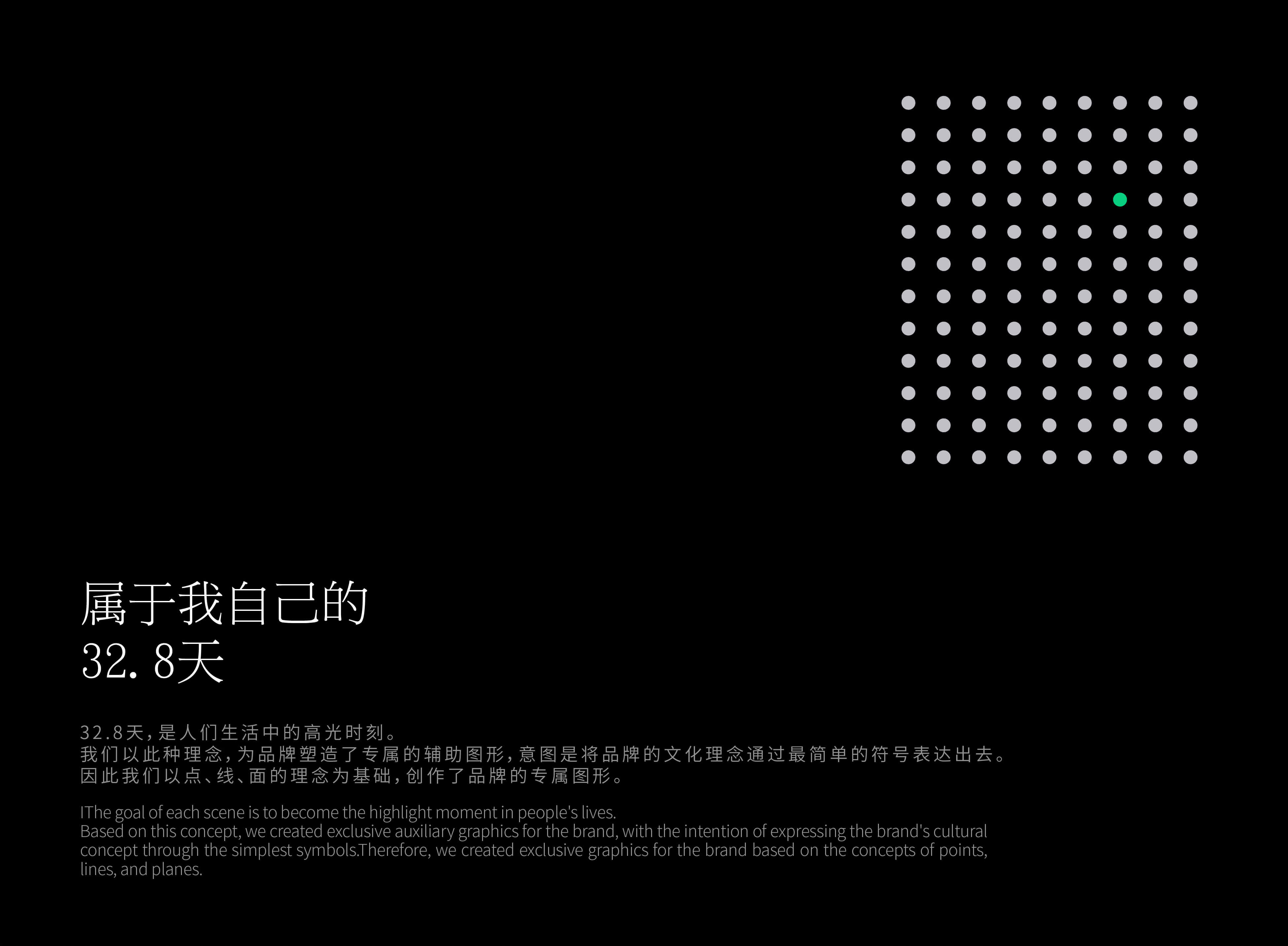
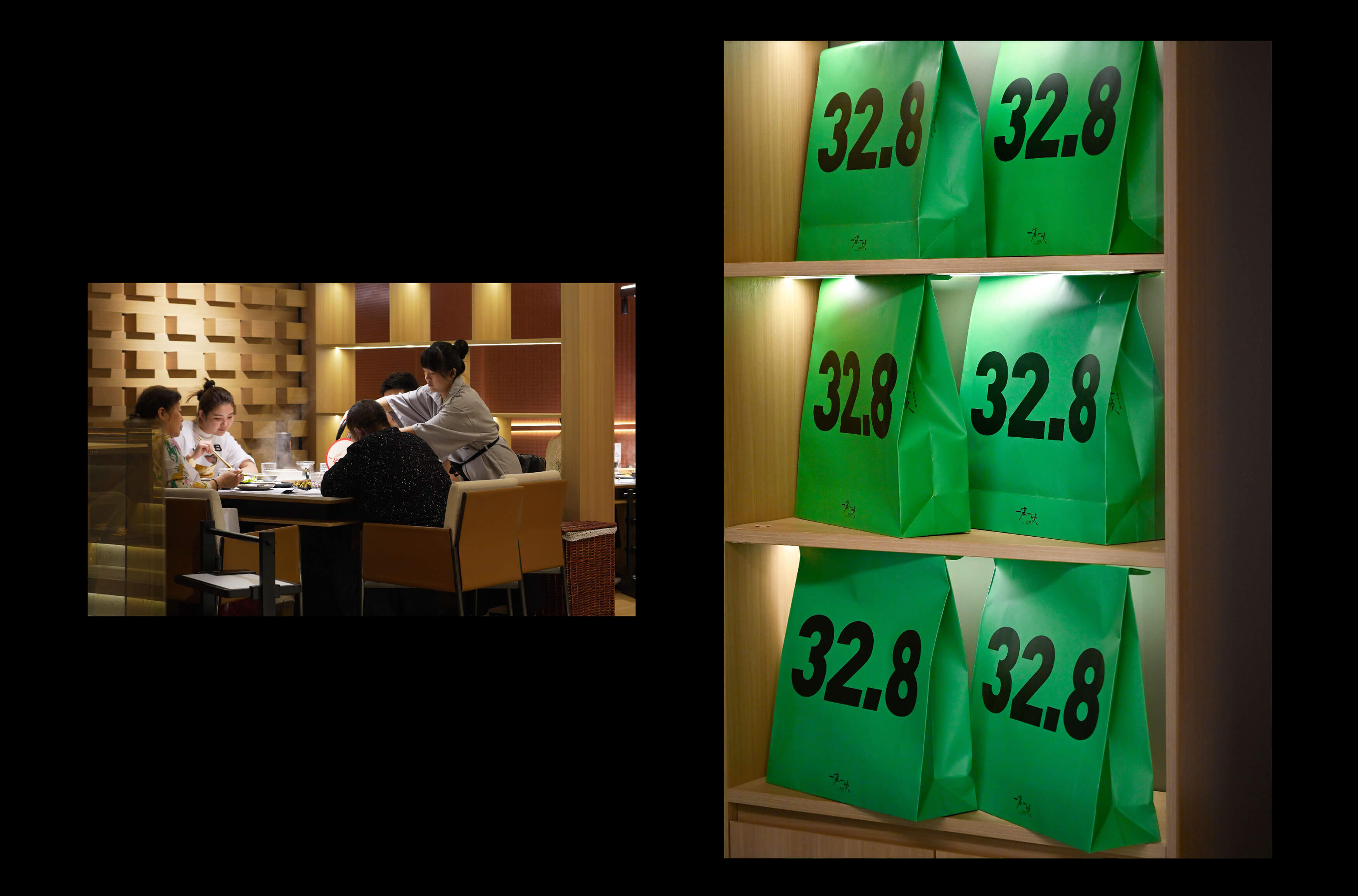
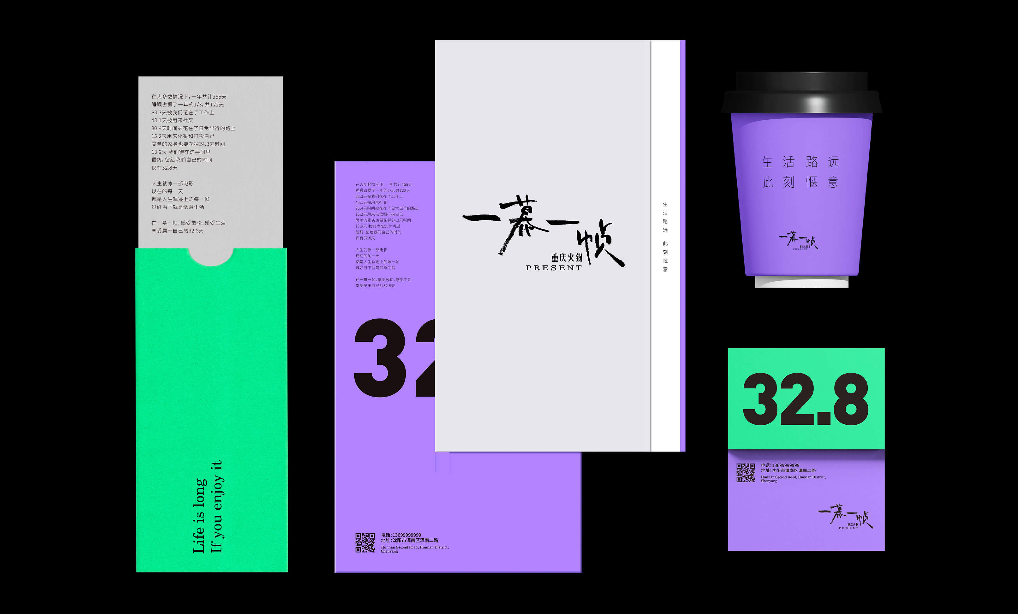
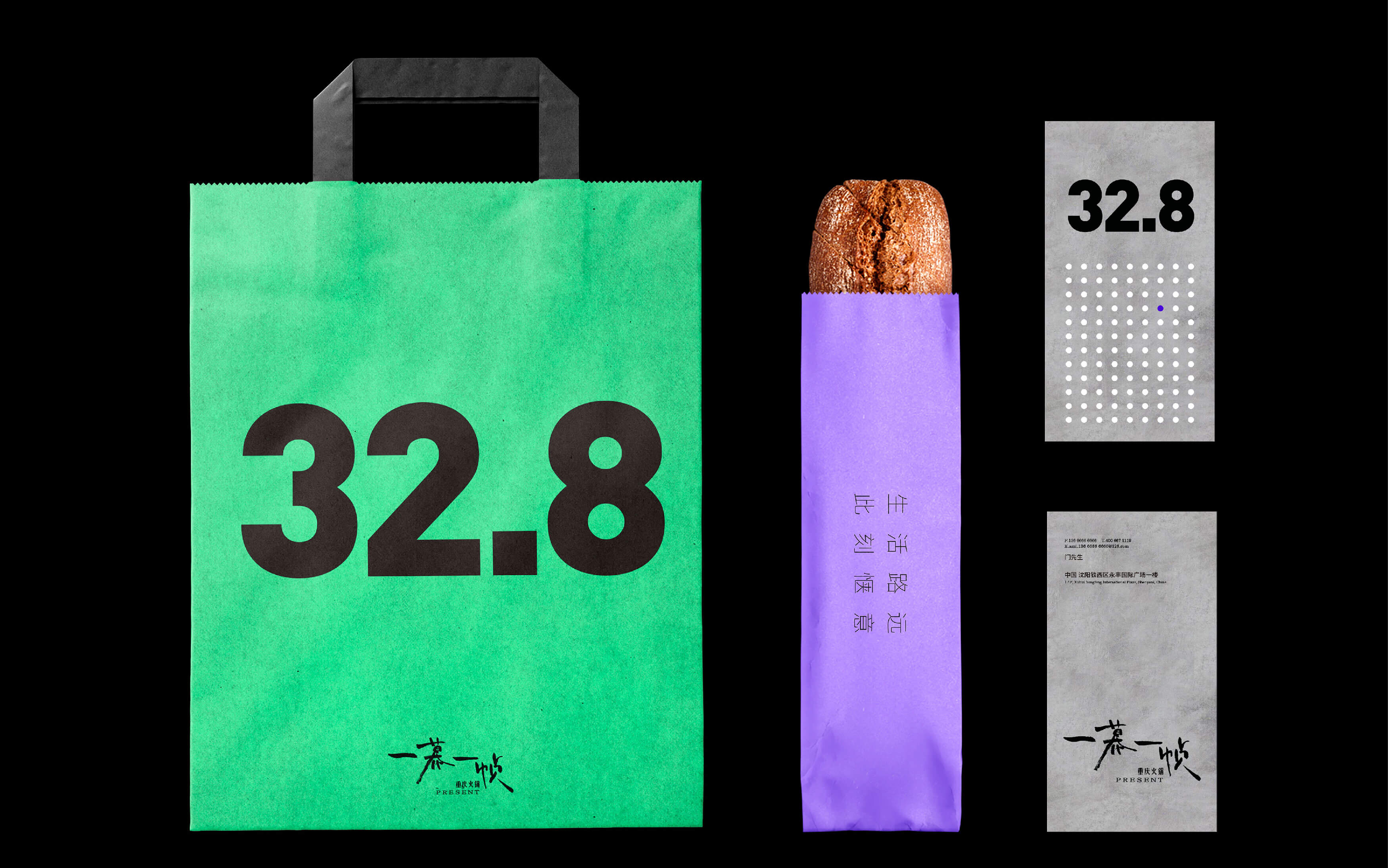
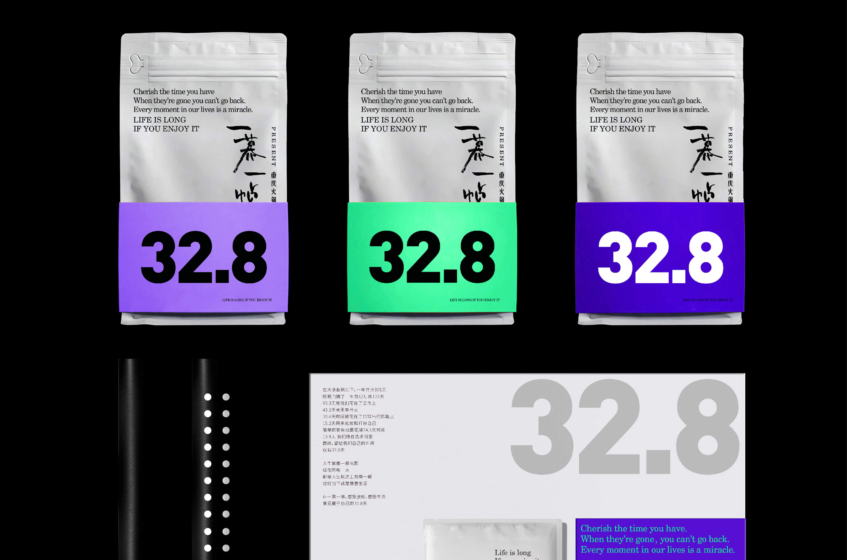
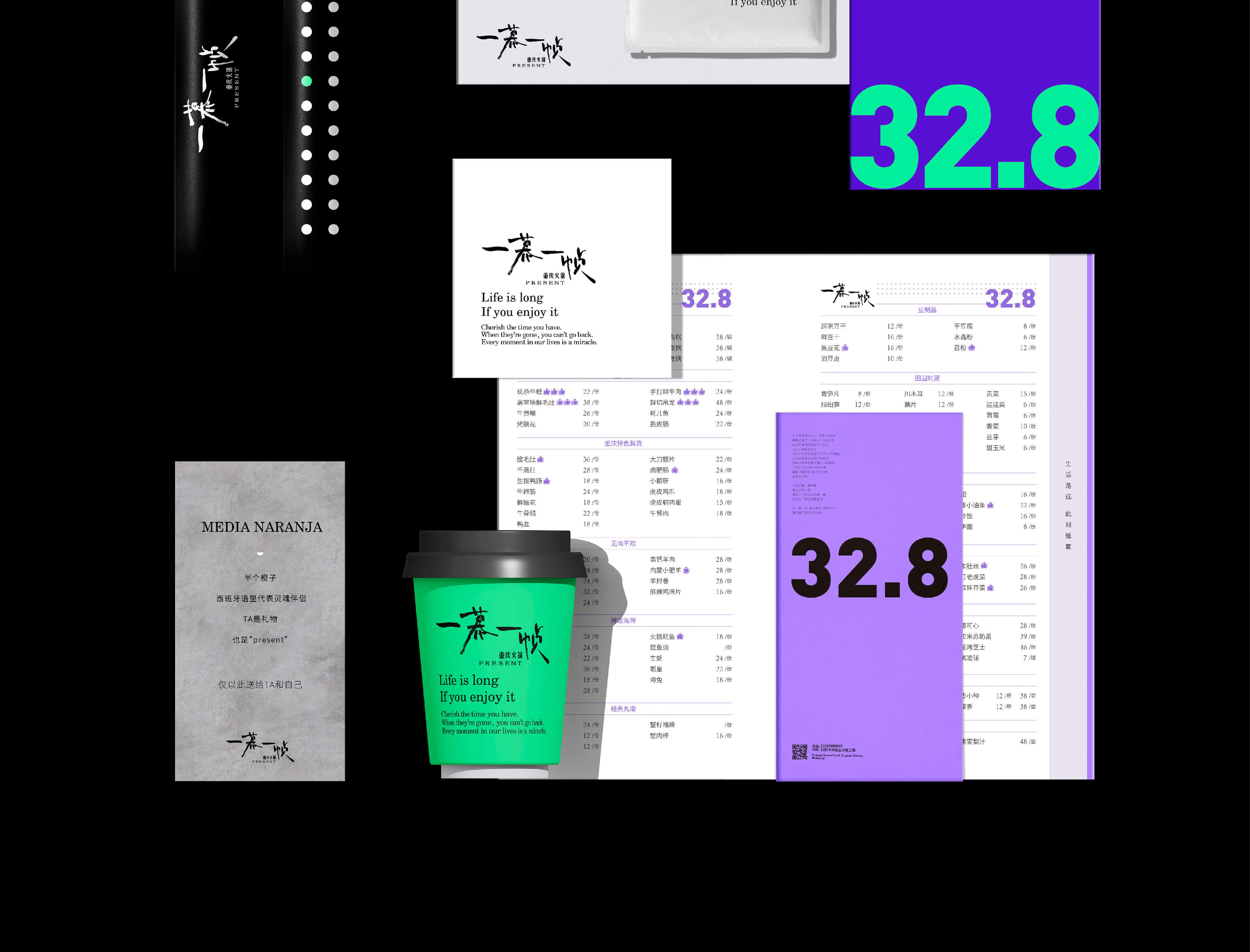
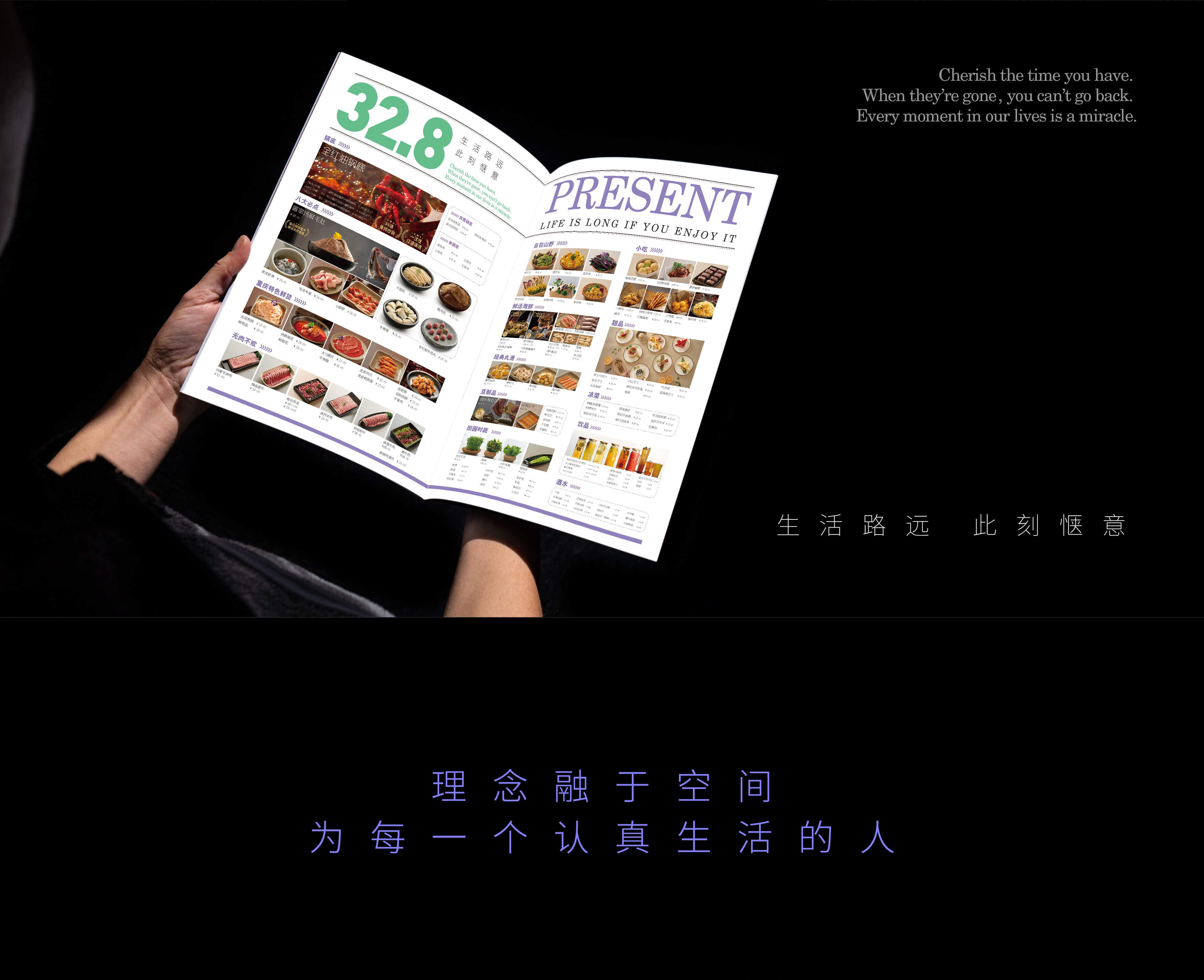
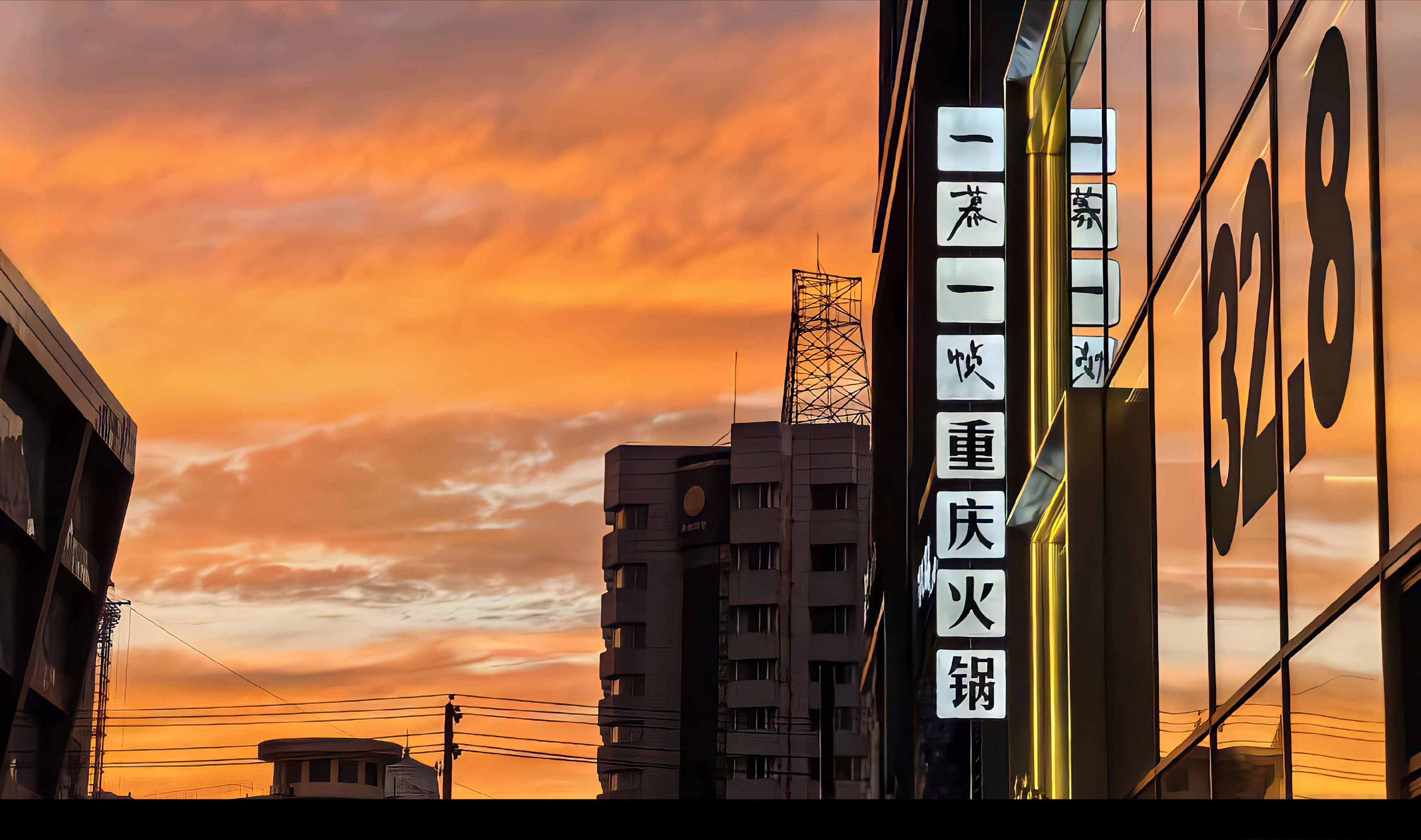
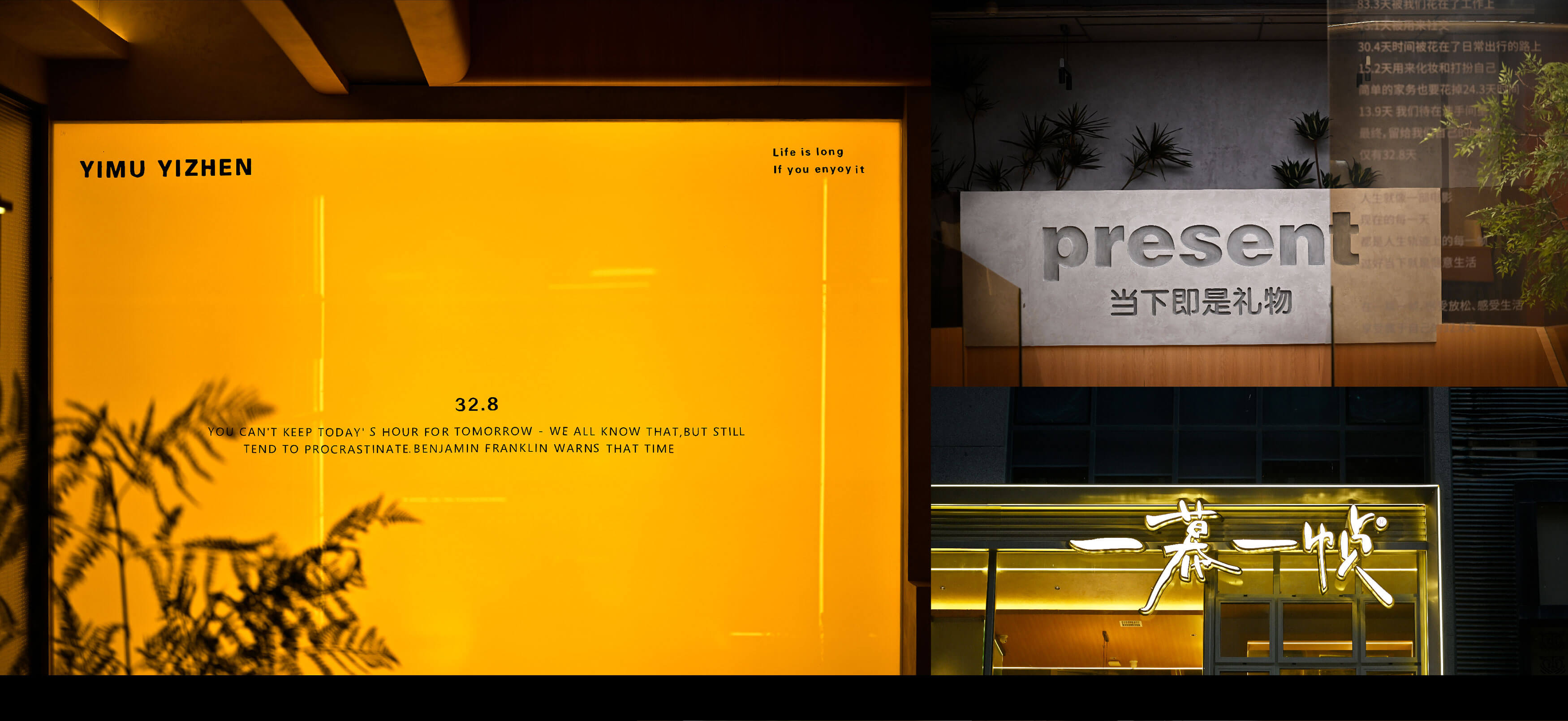
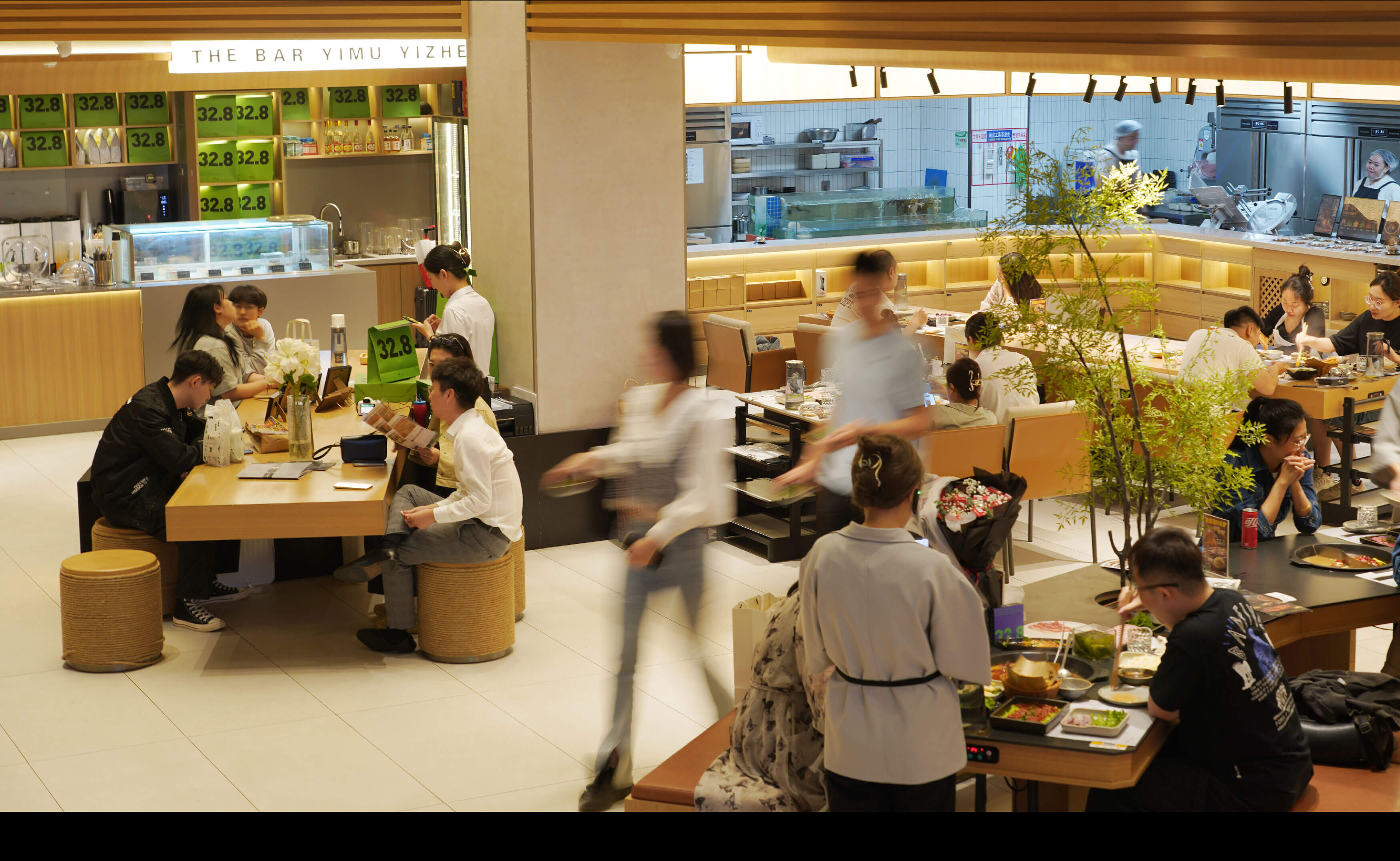
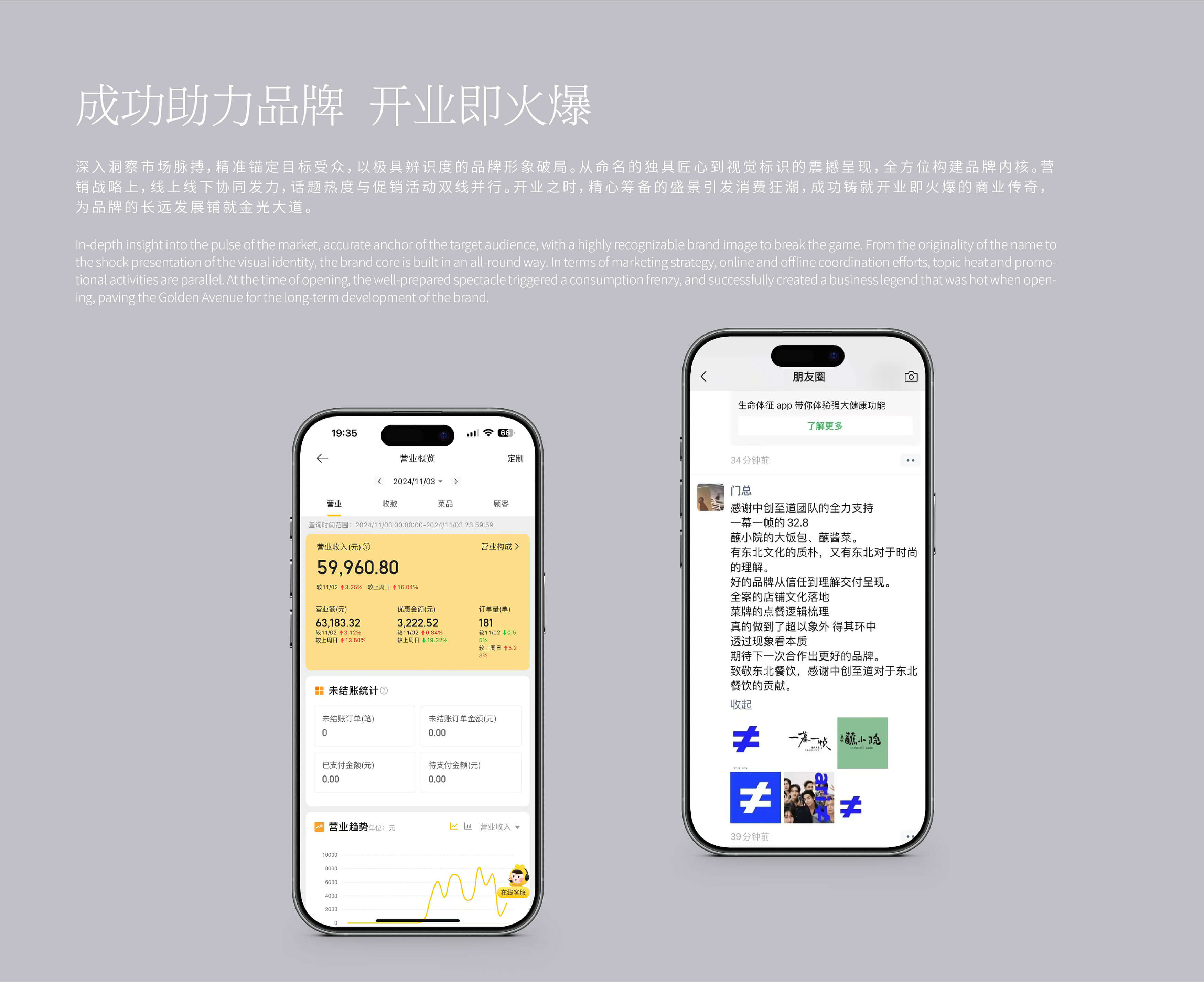
在一幕一帧的品牌塑造过程中,至道品牌深入洞察市场脉搏,精准锚定目标受众,为其提炼出“32.8,生活中的高光时刻”的数字元素,作为品牌的超级符号。作为现代新重庆火锅品牌,一幕一帧将目标客群定位在相对年轻的人群上,选择用现代美学方式塑造品牌。因此,我们在超级色彩上大胆选择了高明度对比色。同时通过大面积色块、大面积撞色以及不同的配色方案,将品牌核心符号通过不断洗脑的方式呈现给消费者,借此占位消费者心智,打造强有力的品牌视觉锤。至道品牌助力一幕一帧,从命名的独具匠心到视觉标识的震撼呈现,让一幕一帧以极具辨识度的品牌形象,从一众重庆火锅品牌中破局而出。
In the brand-building process of Present, Itari Design delved deep into market insights, accurately targeting its audience and refining the number "32.8, the highlight moments in life" as its brand's super symbol. As a modern new Chongqing hotpot brand, Present targets a younger demographic and chooses to shape the brand using modern aesthetics. Therefore, bold high-contrast colors were chosen for the brand's super color scheme. Through the use of large color blocks, bold color collisions, and various color combinations, the brand's core symbol is presented to consumers in a repetitive, brainwashing manner, occupying their minds and creating a powerful visual hammer for the brand. Itari Design helped Present stand out from other Chongqing hotpot brands with a highly recognizable brand image, from the ingenious naming to the stunning presentation of its visual identity.